
Yet more evidence of vaccine failure
All HART articles also on Substack. Please consider a PAID SUBSCRIPTION so we can continue our work. Comments are open so you can join in the conversation.
At face value the data from intensive care shows a marked difference in admission rates between the unvaccinated and vaccinated population. However, it is not all as it seems.
Before looking more closely at vaccination status it is worth reminding ourselves of the overall impact of vaccination. For each wave, Wuhan, Alpha and Delta the proportion of the population who was susceptible, as measured by the percentage of household contacts who contracted covid from a case was around 10%. The Delta wave was post vaccine and had the vaccine made fewer people susceptible to infection this would not have been the case. Furthermore, the total numbers admitted to intensive care were similar for each wave. In the UK the admissions were more spread out over time in the Delta wave but this was not true elsewhere so is unlikely to have been an effect of vaccine.
Auditing admission data from intensive care resulted in a stunning graph that claimed over half of admissions from May to December 2021 were in the unvaccinated population. What is missing from this data is the number of admissions where the vaccine status was not known. In the USA people with unknown vaccine status in the hospital systems were recorded as unvaccinated causing huge distortion of the data. Is that what has happened here?
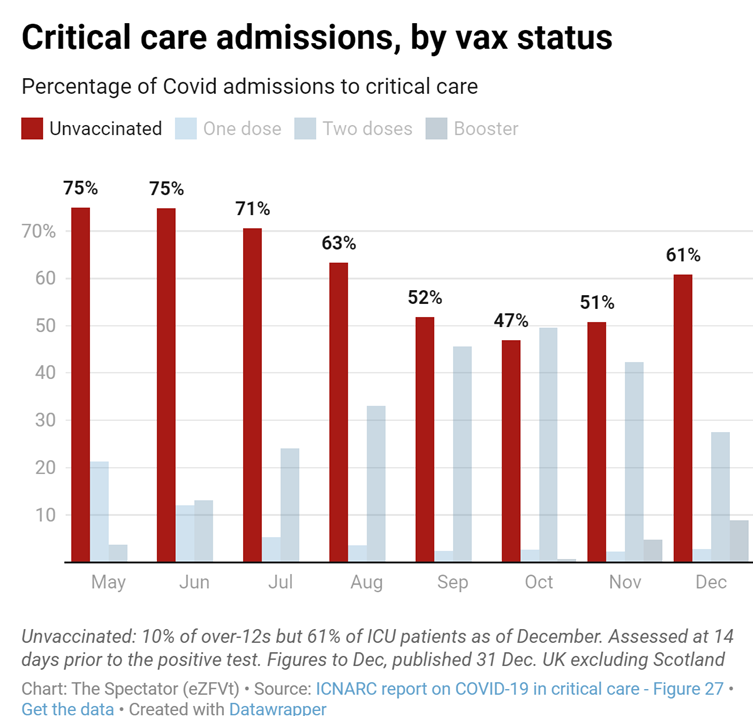
Given that the same proportion of the population were susceptible to covid and that in the period in question only 25 to 50% of the population were unvaccinated, it is quite a claim that the same number of intensive care admissions came from this fraction of the population as occurred in the whole population for previous variants. What was the big change in the biology that would have allowed that to happen?
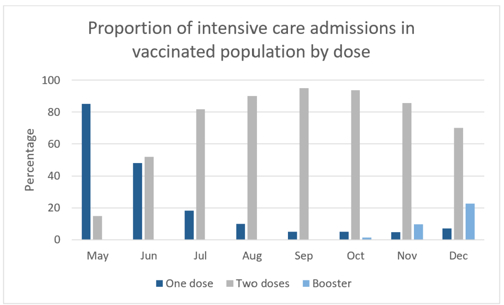
These issues make comparison with of vaccinated with “unvaccinated” meaningless. However, it is worth taking a closer look at the vaccinated population. If two doses were better than one then the proportion of admissions with two doses should be lower than the proportion of the population with two doses. Figure 1 shows the proportion of admissions among the vaccinated population by vaccine status. This appears to reflect how many people in the population were in each of these groupings.
To test that theory we can compare the proportion of admissions by dose with the proportion of the population by dose. Figure 3 shows dose one compared to the population with more than one dose.
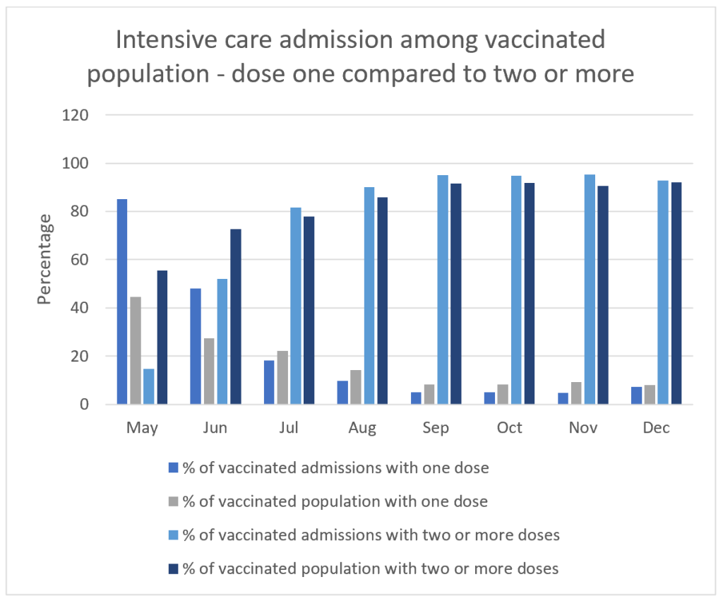
Something odd happens in May and June while rollout continues but beyond then we see a consistent pattern. The proportion of admissions in those with more than two doses is actually higher than the proportion of the vaccinated population who had more than two doses. At face value this implies those who had two or more doses were at greater risk of intensive care admission than those who had only one dose.
To try and understand what happened in May and June we can look in a bit more detail and compare dose two and three. Figure 4 shows this data. As boosters are rolled out the proportion of admissions who had two doses becomes much higher than the proportion of the population with two doses. There was no evidence of “waning” before the start of the next dose rollout. This is highly suggestive of admissions within a few weeks of dose three being misclassified as dose two admissions. If the same happened with early dose two admissions being classified as dose one case that would explain the odd data in May and June. ICNARC reports state that they regard the first two weeks after injection as being classified as not having happened.
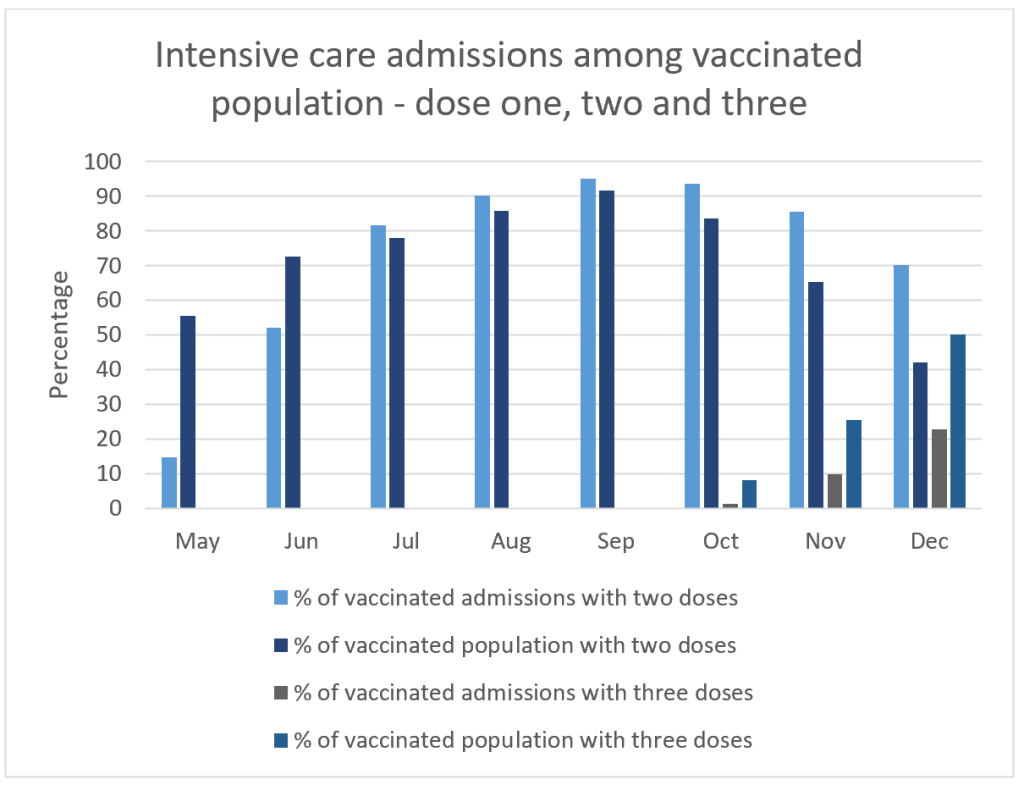
There are only two conclusions that can be drawn from this data. Either all the benefit was apparent with dose one and dose two and dose three did not contribute to any further benefit. Or else there was no benefit with any of the doses. The latter remains a possibility given the overall admission rates over the course of the whole wave.