
By Joel Smalley
Quantitative Data Analyst
Modelling can accurately predict excess mortality associated with COVID-19 outbreaks. Policies can therefore be tailored to minimise collateral harms and maximise benefits.
Mortality data can help us unravel the 2020 COVID-19 outbreak and the effects of associated interventions. When we try a new experiment such as lockdowns on the entire nation, it is our duty as scientists to forensically assess its effectiveness. If not, we risk making the same mistakes again in future scenarios.
A full-length analysis is available on this website, here. This briefing looks at two main questions.
1. Were lockdowns successful in preventing deaths?
2. What effects did the vaccine roll-out have on mortality?
Observations from the data: what is the real COVID-19 mortality picture?
Viruses tend to follow a predictable and self-limiting path. The growth rate has defining characteristics that have been analysed and published numerous times, creating a characteristic curve.1 This is because (a) herd immunity increases over time and (b) there are fewer susceptible individuals available as the most vulnerable succumb early on in the outbreak. In addition, viruses are known to mutate to become less virulent over time, hence increasing their own chances of survival and replication by not killing their host.2 This reduces human mortality over time whilst increasing the herd immunity effect as it passes successfully through the population without the associated deaths. It should be noted that:
● Not everyone can catch COVID-19;
● Many have pre-existing immunity so would never be a viable ‘host’;
● Studies show this is about 50% of the population.
It became clear from the data that COVID-19 outbreaks were regional, and followed a particular pattern in each area.
By analysing all of the data, it was possible to accurately model the expected mortality of each distinct outbreak with consistent accuracy, region-by-region and even London borough-by-borough.
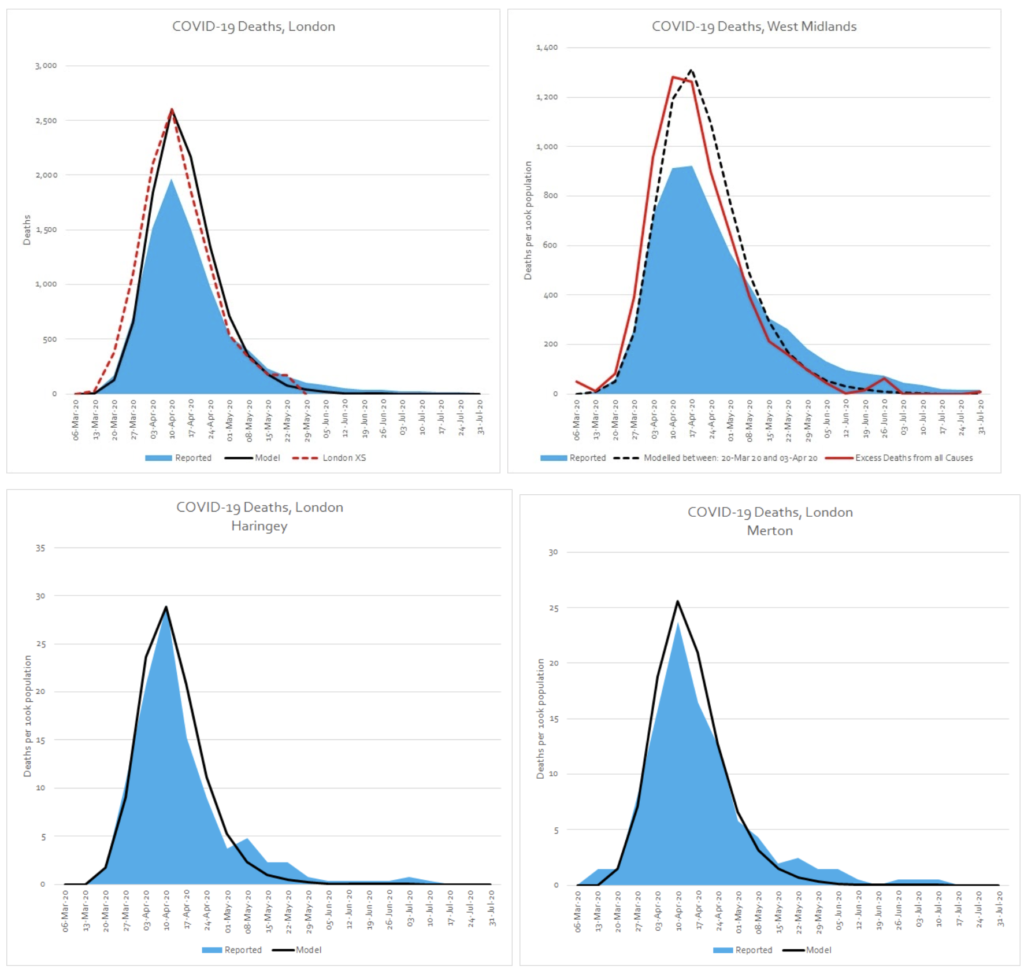
Applying this model with confidence, to future outbreaks, could help policies to be accurately tailored to minimise the collateral harms and maximise benefits. This would help reduce panic and help hospitals accurately prepare.
According to the data, there is a new mortality baseline
After the initial spring epidemic peak, there was never a return to the baseline average weekly deaths. We work out this baseline from the previous years’ data. The ‘new’ baseline after spring 2020 works out at around 400 extra deaths per week. Following the ‘Occam’s Razor’ principle, the most likely explanation for this is that these excess deaths were due to reduced access to healthcare as a result of Government policies. This is both in practical terms, where lots of services were suspended (e.g. cancer treatments, missed operations etc.) but also due to the overly effective ‘stay at home’ messaging, which encouraged people not to seek healthcare unless ‘urgent’. Applying this modelling, it is possible to calculate that there have been just over 20,000 more deaths than expected since April 2020 as a result of this increase in the underlying baseline.
Do lockdowns work, from a data point of view?
Looking at the epidemic period in England during spring 2020, modelling shows that in spite of the restrictions (or perhaps in part because of them) there were in fact roughly 1,000 more excess deaths than would have been expected from the COVID-19 outbreak alone, had no interventions been implemented. Analysing the data, it is possible to see that the large amount of non-COVID excess deaths occurring in care homes is the most significant factor in this. From a data point of view, it would seem that the lockdowns did not have the desired effect of saving lives overall during this period. The analysis also shows that the Ferguson/Imperial College model was out by a factor of 8 times.
A recent study of COVID-19 mortality in Scotland found that outside of care homes, COVID-19 was substantially acquired in the hospital setting.3 It is likely that the situation is comparable in England. National lockdowns would have had zero impact on stopping these nosocomial (caught in hospital) infections.
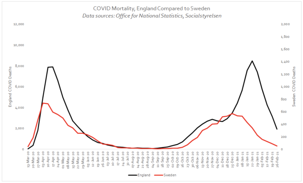
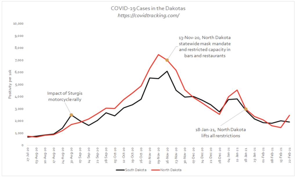
When considering the effect of lockdowns and other interventions on mortality (social distancing, mask-wearing etc.), comparisons with similar places that did not lock down are also instructive. There are 2 main outliers that provide this comparison:
(a) Sweden, which is comparable to England in many ways but did not impose lockdowns;
(b) North and South Dakota in the US, which are very similar neighbouring states, one who imposed restrictions (North Dakota) and one that did not (South Dakota).
The following graphs show how Sweden actually fared better than England, and there was very little to choose between the Dakotas. These are compelling pieces of evidence that are often overlooked in the ongoing debate as to whether lockdowns are effective. It is understandable, due to the immense harms that lockdowns have inflicted, societally, economically, psychologically, that there is a desire for it not to have been all for nothing. Unfortunately, this just does not show up in the data. We may have to accept this inconvenient truth, particularly if it saves us from employing the same erroneous logic in the future.
Mortality data during the vaccine roll-out period
In autumn 2020, residual outbreaks started, as one would expect with viral seasonality, mostly in areas of the country that COVID-19 did not saturate in spring due to a combination of lockdowns and more remote geography. These areas were predictably hit harder in autumn/early winter 2020.
Using the modelling, region-by-region, the total expected COVID-19 excess deaths for England from October to Feb was 25,742. We see 2 distinct regional ‘outbreaks’ below, in the North East and the North West (red dotted line, green dotted line) that follow a predictable course.
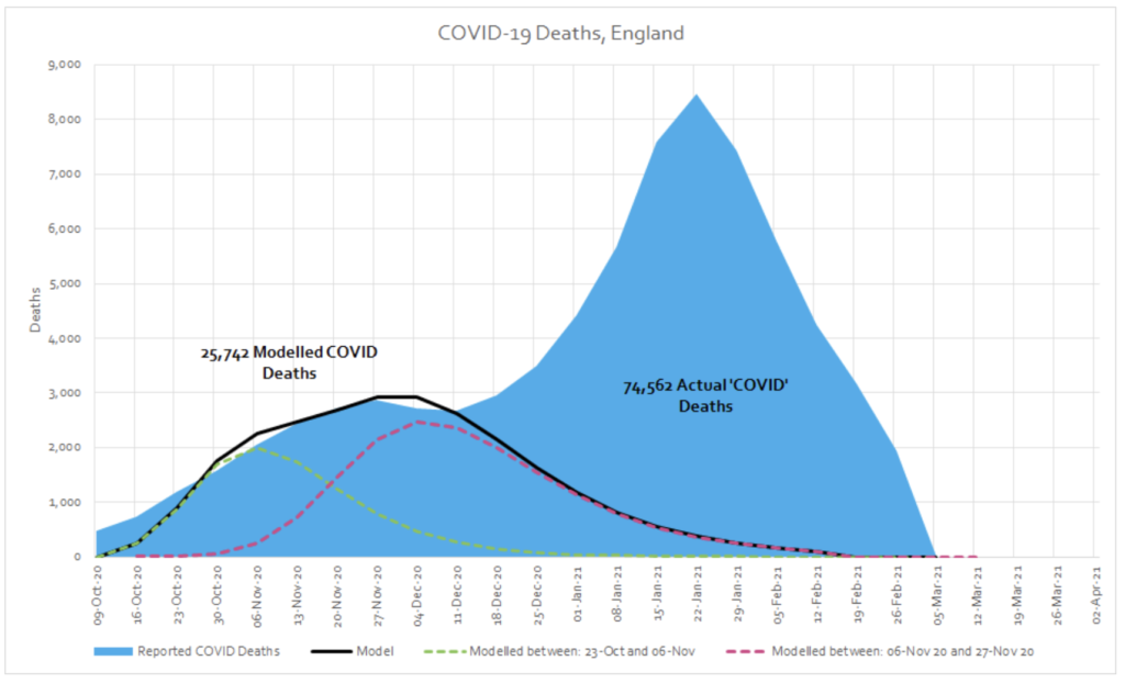
Around the second week of December a new ‘mortality series’ begins which does not fit with the pattern seen in spring or autumn. In the period from December to February, there were a total of 48,821 excess deaths (74,562 in total minus 25,742 ‘expected’ COVID-19 deaths) whose distribution is characteristically very different to spring. We would expect it to follow a similar pattern if COVID-19 was the underlying cause of this excess.
The population, demographics and the model did not change. Something new must have exerted this effect. When something in data is this unusual, we have to ask questions, no matter how uncomfortable they may be. It is an undeniable fact that this peak in deaths coincided with the mass roll-out of novel mRNA/DNA vaccines, on an extremely vulnerable population. If you compare the week ending 11 December 2020 with the week ending 29 January 2021, there was a 62% increase in total deaths and a 170% increase in COVID-19 labelled deaths in care homes.
Broken down by the separate vaccination cohort (by age group, and then taking care homes as a separate unit), the correlation between vaccination and COVID-19 deaths is even more apparent and this time the model is able to accommodate the data with significantly more ease.
This relationship is not limited to England. It is apparent in many countries around the world, regardless of location, season, interventions and extent of prior COVID-19 activity. If we include Scotland in the analysis, if winter COVID-19 excess deaths were a natural phenomenon, we would have to explain how and why it emerged first in the over 80s in England then a few weeks later in the care homes in Scotland before then jumping suddenly back to the care homes in England, before landing finally in the over 80s in Scotland.
Whilst we cannot infer causation from correlation, the mRNA/DNA vaccines had not been tested on this cohort, who have many comorbidities, multiple drug interactions and fragilities compared to trial participants and were likely particularly fragile after a year of social isolation away from loved ones. It would be extremely unscientific and even negligent not to investigate whether the rise in deaths during this period is linked in some way to the vaccine roll-out.
From a data point of view we need to ask:
● Is there a link between vaccine roll-out and a rise in cases and deaths in care homes?
● Does country by country or region by region data support or refute this possible link?
● Is follow-up data of vaccine recipients being carefully recorded for further scrutiny?
Before 2020, these would have seemed like very reasonable questions. We have entered a dangerous time where science is being censored using harmful labels like ‘anti vaxxer’. This is incredibly worrying. It is our duty as ethical scientists, and indeed citizens, to insist that these questions are properly investigated by independent bodies free of financial conflicts of interest. Indeed to date, ten countries have suspended use of the AstraZeneca vaccine amid blood clot fears.4 This recent open letter to the European Medicines Agency seems to concur that further investigation is required.5
Endnotes
1. Comparison of Growth Patterns of COVID-19 Cases through the ARIMA and Gompertz Models. Case Studies: Austria, Switzerland, and Israel
2. We shouldn’t worry when a virus mutates during disease outbreaks
3. Relation of severe COVID-19 in Scotland to transmission-related factors and risk conditions eligible for shielding support: REACT-SCOT case-control study
4. European countries suspend use of AstraZeneca vaccine over blood clot death fears
5. Urgent Open Letter from Doctors and Scientists to the European Medicines Agency regarding COVID-19 Vaccine Safety Concerns