
By Joel Smalley, MBA
Quantitative Analyst
Introduction
This article presents an analysis of the impact of the SARS-CoV-2 respiratory virus on excess mortality in England. It is an investigative, open-minded attempt to find an explanation for the pattern of excess mortality recorded so far that fits the empirical data. All the data and studies referred to in the graphs below are taken from official UK Government statistics, published by the Office for National Statistics (ONS) and Public Health England (PHE). There are links to other relevant articles, studies and sources at the bottom of this article.
Context
Before the start of the COVID-19 pandemic last year, how many of us knew the average number of people who sadly died in England each day? How many of us knew how many people, on average, died from flu, pneumonia and other respiratory diseases each winter? Beyond the fields of medicine, statistics and associated branches of Government, the answer must surely be that very few of us did.
When attempting to measure and understand the impact on mortality of the SARS-CoV-2 virus, this context is important. This is why we will start this analysis by taking a detailed look at the pattern of seasonal excess mortality recorded in England between 2014 and 2019, before the SARS-CoV-2 pandemic started. We can then understand how seasonal respiratory viruses typically behave. We can also establish a baseline above which we can analyse the seasonal patterns of excess mortality expected in a “typical” year.
In this analysis, this context is crucial in order to assess the impact and behaviour of the SARS-CoV-2 respiratory virus by comparing it with previous years.
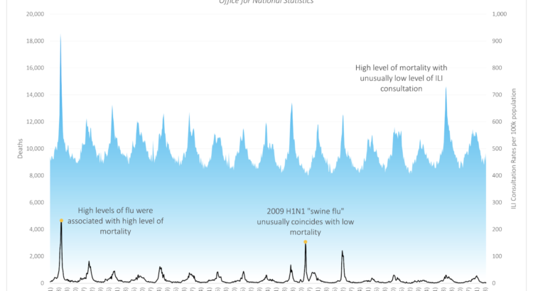
Figure 1 – All Cause Mortality in England, 1999 to 2016
Blue line is the influenza like illness rates (right axis) and black line is the all cause mortality rate (left axis).
An analysis of excess mortality in England between 2014 and 2019
By now, most people will be familiar with the Government’s daily updates on the number of positive tests, hospital admissions and deaths related to COVID-19, as collated by Public Health England (PHE). However, it is unlikely that many people are aware that for years PHE and the Office for National Statistics (ONS) have been publishing weekly and annual surveillance reports to measure the impact of flu, pneumonia and other diseases on mortality. It is these publicly available surveillance reports for 2014 to 2019 that we will use to create an understanding of the established typical seasonal patterns of excess mortality in England. We will also use that data to create a baseline to compare against 2020/21.
The graph below shows the number of people who died in England each month from all causes between September 2014 and January 2021. Each winter season, more people die than in summer, as can be seen as large spikes on the graph. Sometimes all cause mortality spikes up in summer, as more people die than usual during a heatwave. The spike that can be seen in August 2020 is an example of this.
Figure 2 – All Cause Mortality in England, 2014 to 2020
Blue area shows weekly all cause mortality from 2014-2021. Yellow dots show summer minimum deaths. Black dotted line shows the trend in summer minimums.
There are different statistical methods to calculate a baseline figure for the weekly numbers of death within a population. We have used England’s summer baseline for this – i.e. the average number of deaths in the weeks of the summer with the lowest levels of all-cause mortality (marked with an orange dot on the graph), which works out as 7,869 deaths per week. This summer baseline for mortality in England is shown on the graph with a dotted black line and, as you can see, this weekly baseline figure has not varied significantly over the last five years. Indeed on average we would expect in a typical year the summer baseline to be 7,869 deaths.
The main objective of PHE and the ONS’s weekly flu and pneumonia surveillance reports is to track the number of seasonal excess deaths caused by respiratory illnesses each “winter season”. But before we look in more detail to compare the mortality figures for individual years, it is important to select the most useful reporting period.
Respiratory viruses are seasonal so our period of statistical comparison should be seasonal too. This is why we have used the following annual reporting period – starting each year at the start of September and ending the following year at the end of May – to include a full “winter season” for excess mortality.
So, to recap: we have now calculated two things using the PHE and ONS data. First, we have created an averaged summer baseline of 7,870 deaths per week from which to measure seasonal excess mortality in the “winter”. Second, we have defined the “winter season” for flu, pneumonia and other respiratory illnesses as a nine-month period spanning September to May, inclusively, so that we can measure the impact of different respiratory viruses on different “winter seasons” in a logical, like-for-like way.
Excess winter mortality between 2014 and 2019
Now let’s look at the PHE data recording the excess mortality in England for the following “winter seasons”: 2014/15, 2015/16, 2016/17, 2017/18 and 2018/19. Each graph has labels showing the total number of excess deaths recorded that season; the percentage of those deaths for which a respiratory disease was recorded on the death certificate as the underlying cause; and the names of the respiratory virus or viruses that were dominant during that “winter” season.
Figure 3 – “Winter” Deaths England 2014/15
Blue area shows weekly winter deaths with the first and second dominant virus labelled in black.
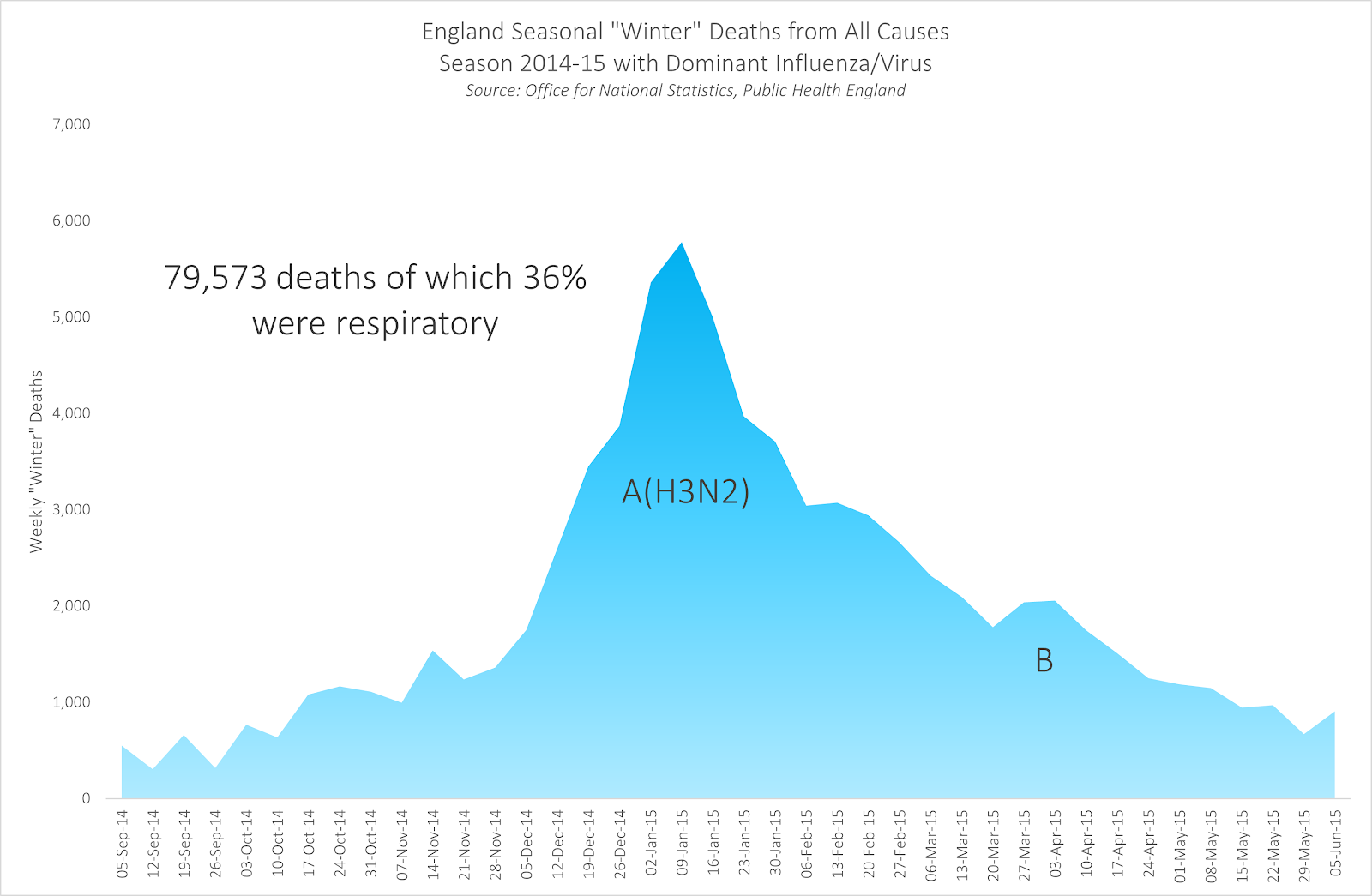
Figure 4 – “Winter” Deaths England 2015/16
Blue area shows weekly winter deaths with the first and second dominant virus labelled in black.

Figure 5 – “Winter” Deaths England 2016/17
Blue area shows weekly winter deaths with the single dominant winter virus labelled in black.
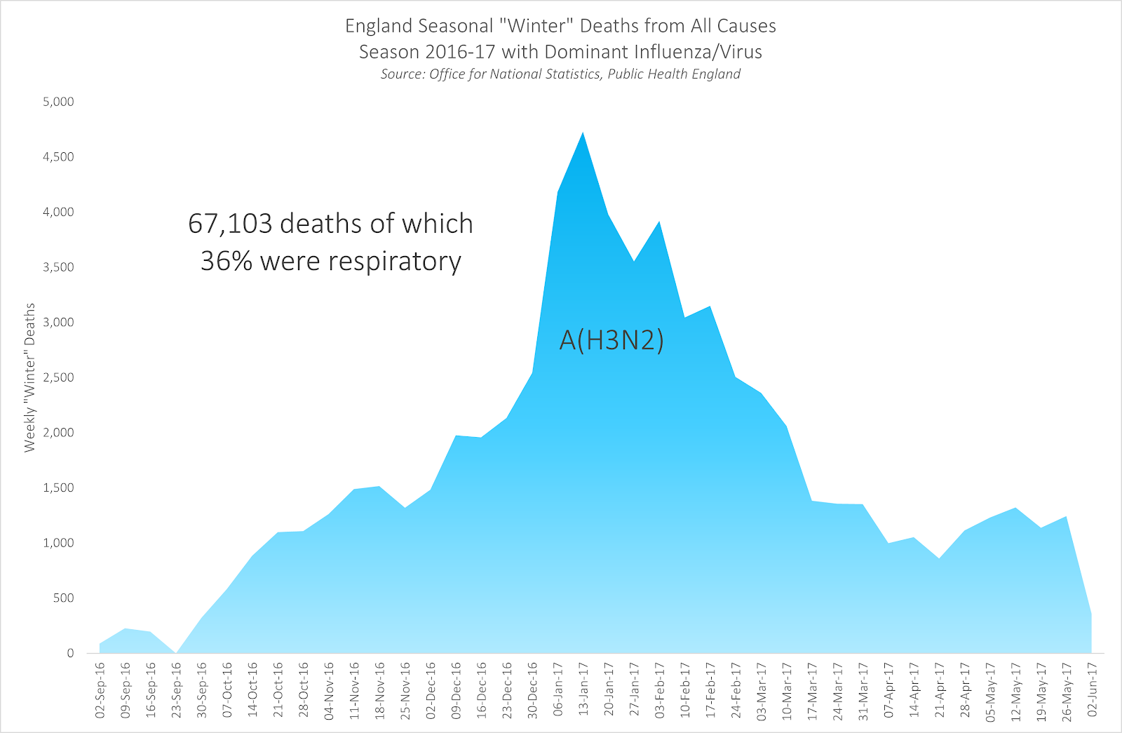
Figure 6 – “Winter” Deaths England 2017/18
Blue area shows weekly winter deaths with the first and second dominant virus labelled in black.
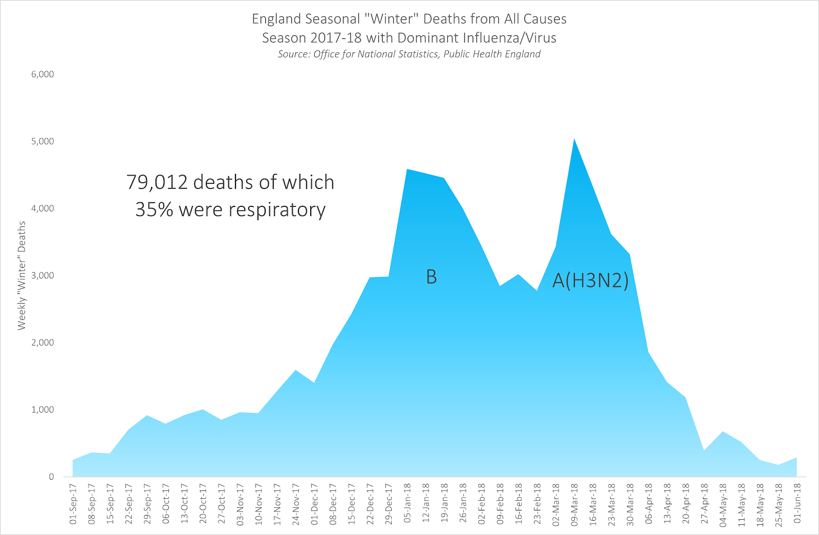
Figure 7 – “Winter” Deaths England 2018/19
Blue area shows weekly winter deaths with the first and second dominant virus labelled in black.
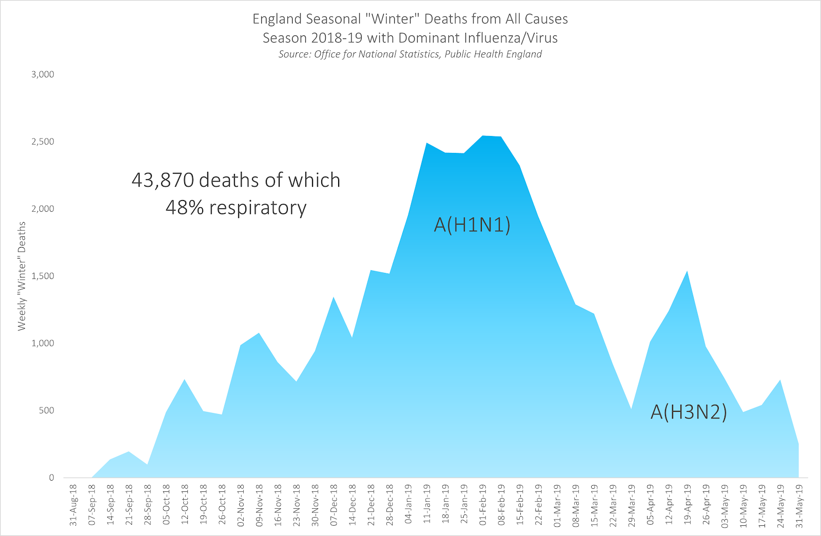
Although each “winter” flu season is different, their mortality curves do generally conform to a consistent pattern. In most “winter” seasons, there are two humps of excess mortality, often driven by two sequential dominant respiratory viruses. However in some winters, such as 2016/17 for instance, there is one, longer hump driven by a single dominant respiratory virus.
A couple of points to note here. First, in each of these five “winter” seasons, respiratory disease was identified as the underlying cause of death in more than a third of all excess deaths. (And in 2018/19 respiratory disease accounted for almost 50% of all excess deaths.) Second, it provides useful context to see the significant rise in mortality in severe flu seasons, such as those recorded in 2014/15 and 2017/18, when almost 80,000 seasonal excess deaths were recorded.
Creating an average seasonal curve for excess winter mortality
Now we have looked at what those individual “winter” seasons look like we can create a 5-year seasonal average, to represent a typical season. This helps to set a benchmark – both in terms of the total number of “winter” excess deaths and the pattern in which they are distributed over time. We can then measure the impact of SARS-CoV-2 against this ensemble of the last 5 years. The graph below shows the weekly excess deaths of the individual winter seasons (the coloured dotted lines) and the 5-year average (the solid black line).
Figure 8 – Excess “Winter” Deaths, England 2014 to 2019
Total weekly mortality plotted for the whole winter season by year. Each dotted line represents a different year with the solid black line showing the average.

There are three points to note here.
First, note how a clear pattern of excess mortality emerges when the curves of the different “winter” seasons are superimposed on the same graph. Most of the variation in deaths occurs between mid-December and mid-January.
Second, you can also see the significant impact on excess mortality driven by A(H3N2), when it appeared as the second respiratory virus of 2017/18, leading to the pronounced spike in mortality between March and April 2018, completely out of seasonal expectation. And it is this later, secondary spike that leads to a particularly high number of winter deaths that year.
Third, and this is in many ways the most striking feature of all, is the reappearance of that same A(H3N2) flu virus across multiple “winter” seasons. Indeed, there is only one “winter” season over the last five years – 2015/16 – in which the A(H3N2) virus does not appear as one of the two dominant seasonal respiratory viruses driving excess mortality.
Were the PHE reports to record cumulative totals of deaths caused by all respiratory viruses across multiple “winter” seasons, the current cumulative total for the A(H3N2) virus would run into hundreds of thousands – even with the additional protection provided by the flu vaccine.
An analysis of the impact on excess mortality of the novel respiratory virus SARS-CoV-2 in the 2019/20 “winter” season
Now let’s use PHE’s data showing how seasonal respiratory viruses typically behave and that benchmark curve showing the 5-year average for excess winter mortality to put the events of the 2019-20 season into proper context.
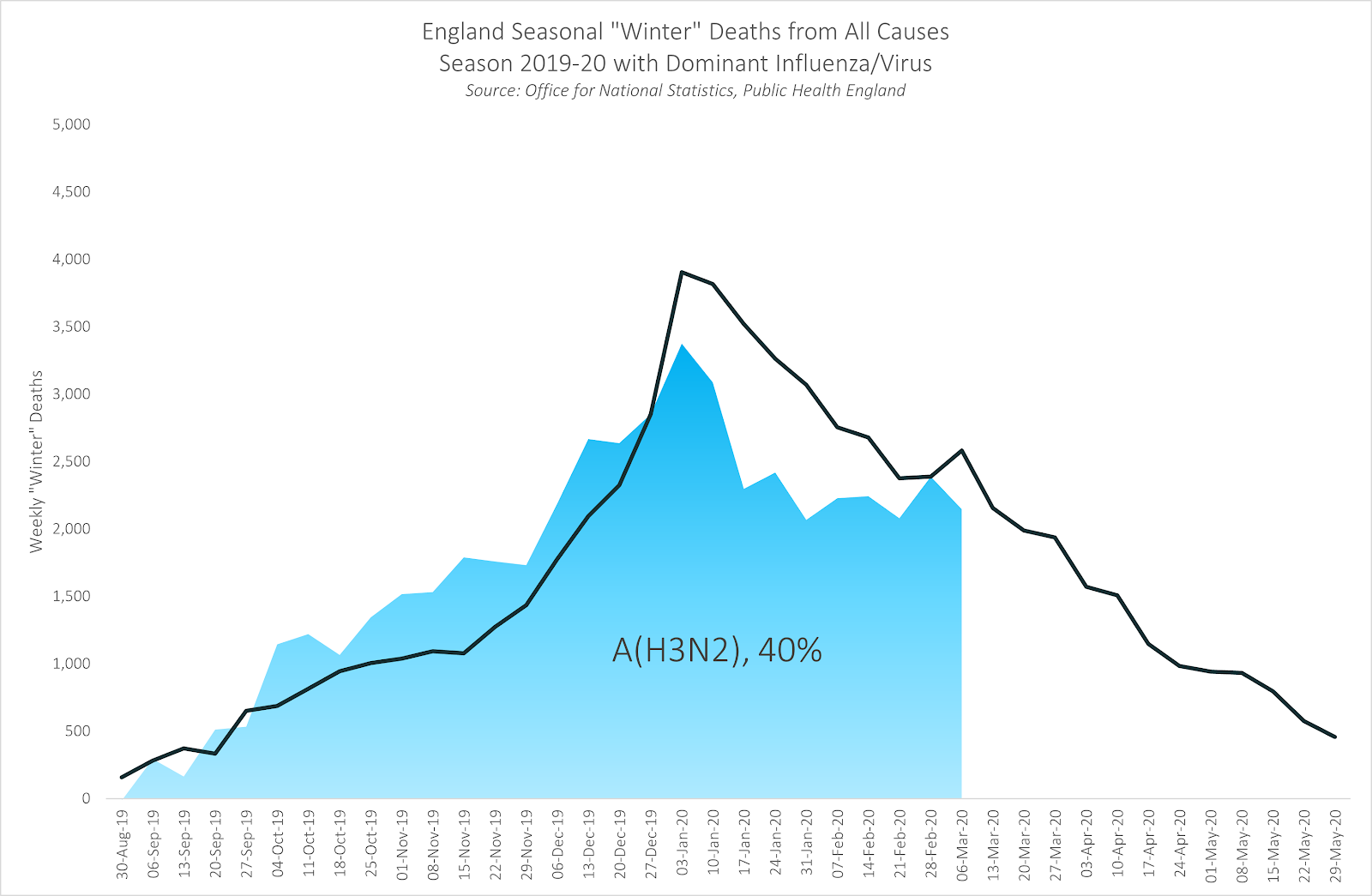
The graph below shows the impact of A(H3N2), the dominant flu virus of the first half of the 2019/20 winter season. As you can see, there was a significant number of seasonal excess deaths in the last “winter” season that were not attributed to the COVID-19 pandemic. Of these 65,030 deaths, almost 40% were attributed to respiratory illnesses.
The 2019/20 mortality curve fits the 5-year seasonal average almost perfectly, with steep acceleration in December, followed by a peak around the end of the year and a relatively steep deceleration from there. PHE reported that 40% of deaths were due to respiratory disease.
Figure 9 – “Winter” Deaths, England 2019/20
Blue area shows weekly mortality during period of dominant A(H3N2) with black line showing 5-year mean of seasonal mortality for comparison
The graph below now introduces the impact of the SARS-CoV-2 respiratory virus from March onwards:
Figure 10 – “Winter” Deaths, England 2019/20
Blue area shows weekly mortality; black dotted line shows 5-year mean mortality; grey area shows deaths not attributed to SARS-CoV-2 on death certificate

According to virology – the branch of science that specialises in the study of viruses – viruses that are new, or “novel”, are believed to have a greater impact on health and mortality the first time that they pass through a population. This is because no-one within the population may have encountered the virus, or similar viruses, before and as a result their immune systems are less prepared to combat it.
Because SARS-CoV-2 was just such a novel respiratory virus, it therefore created an immediate and significant spike in deaths as it moved through the population of England between March and May, as you can see in Figure 10.
This dramatic spike in excess mortality over a relatively short time period presented a significant and alarming challenge to the NHS, and led to 42,580 deaths. However, it is also worth noting that the A(H3N2) respiratory virus led to around 25,000 excess deaths above the summer baseline, which is just under 60% of the total deaths caused by the SARS-CoV-2 respiratory virus in the same “winter” season.
Excess deaths in spring 2020 that were not caused by SARS-CoV-2
Figure 10 also includes a significant number of excess deaths above the summer baseline that occurred during the first national lockdown in spring that were, according to the Government’s own official statistics, not caused by SARS-CoV-2. These excess deaths are shaded in grey and totalled 13,192 deaths or almost one third of the deaths caused by SARS-CoV-2.
The figure of 13,172 excess deaths not caused by SARS-CoV-2 estimated in this analysis closely correlates to the estimated figures published in an ONS report submitted to SAGE in August. This ONS report estimated that around 41% of the excess deaths during the first lockdown had been directly caused by the lockdown itself. For instance, “as a result of a significant reduction in A&E attendances and emergency admissions”.
At the time, the Government’s decision to impose the first national lockdown was heavily influenced by the mathematical model created by Dr. Neil Ferguson and his team at Imperial College in London. The Imperial model predicted that if the Government took no action, the UK would suffer 500,000 excess deaths due to the SARS-CoV-2 respiratory virus. The same Imperial model also predicted that if the United States took no action, it would suffer 2.2 million deaths. Based on these mathematical projections, the 16,000 excess deaths directly caused by the first lockdown (according to the ONS’s estimates) were considered by some to be “justified” because of the much larger number of excess deaths due to the SARS-CoV-2 virus that the lockdown hypothetically averted. The same ONS report estimated that without the Government interventions in spring 2020, including the first lockdown, there would have been “an estimated 439,000 excess deaths resulting from COVID-19”.
In the next part of this analysis, which will be published on this website in the coming days, we will analyse the actual impact of the SARS-CoV-2 respiratory virus during the first half of the 2020/21 “winter” season.
Key insights:
- Seasonal deaths in England follow a consistent pattern over each “winter” season.
- Respiratory diseases cause a significant proportion – between a third and half – of these seasonal deaths.
- Some respiratory viruses have a significant impact on seasonal mortality in multiple years, causing hundreds of thousands of deaths in total.
- However, before 2020, we had never previously measured the full impact of a seasonal virus using aggressive testing.
- PHE and the ONS had never previously published a running total of a seasonal respiratory virus’s cumulative impact on mortality across multiple seasons, as they are now doing with SARS-CoV-2.
- In the 2019/20 “winter” season, there were more seasonal deaths due to other causes (63,431) than were due to SARS-CoV-2 (42,580) but the much shorter period of occurrence and the virus’s unknown characteristics made SARS-CoV-2 a legitimate cause for concern.
- In addition to this, there were a further 13,172 deaths registered during the 2019/20 “winter” season that were NOT caused by the SARS-CoV-2 respiratory virus. The ONS has concluded that these excess deaths not caused by SARS-CoV-2 – 16,000 by its estimate – were directly caused by the first national lockdown.
Sources:
https://www.ons.gov.uk/news/statementsandletters/estimatingtheimpactsofcoronavirusonenglandsmortalityandmorbidity
https://www.nature.com/articles/d41586-020-01003-6