NHS data tables show major edits since 2020
By Dr Clare Craig
There looks to have been manipulation of NHS data tables for diagnoses. Recent news items reported on a rise in atrial fibrillation but no one seemed to pin down when this escalation truly began. Could it have been due to covid virus or the covid vaccines? These are critical questions so I went to hunt down the data and see for myself. I knew the NHS only produced annual data on diagnoses which would hide when the rise began but I looked anyway.
As I sifted through their “diagnosis” spreadsheet under the tab “primary diagnoses character 4,” I was surprised by an apparent massive spike in cases. The leap led to much higher rates of atrial fibrillation from 6th April 2019 and 5th April 2020. Surely, one could assume that the virus was the culprit, right? However, if that were the case, given the relatively limited number of covid cases before 5th April 2020, one would expect an even more considerable leap the following year. To my bewilderment, the records remained relatively consistent for the next two years.
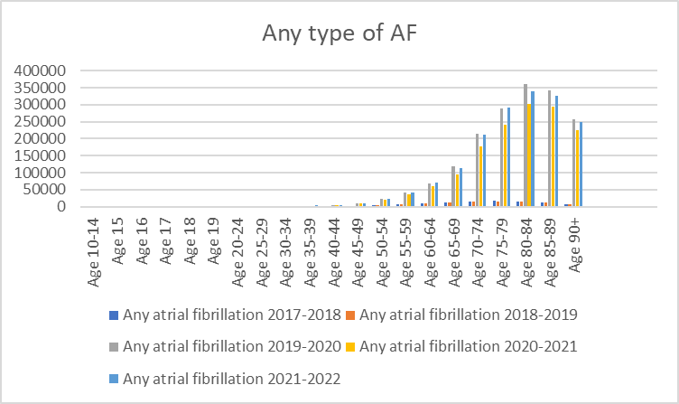
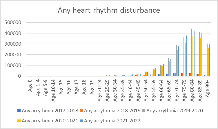
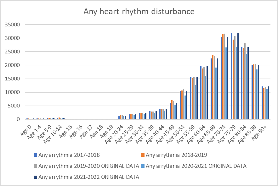
And the strangeness doesn’t end there. On digging deeper, I found this pattern consistent not only with atrial fibrillation but with all heart rhythm disorders! The mystery thickens, leading one to speculate, could it be a change in data collection methods that led to an increase in recording the number of diagnoses per patient?
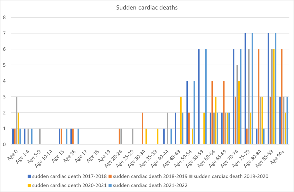
My quest for clarity led me to look at data for sudden cardiac deaths, a statistic that simply cannot be inflated – after all, one cannot die more than once. Still, the same inexplicable leap emerges from the 2019-2020 data. The figures are shockingly inconsistent with the total number of deaths during that time and the rise in cardiac arrest calls made to ambulances since spring 2020. It is crucial to remember that this data only includes hospital deaths, excluding those occurring out of hospital.
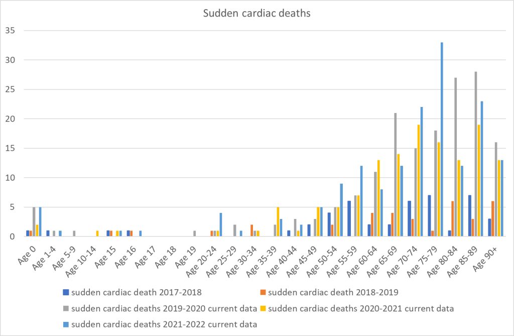
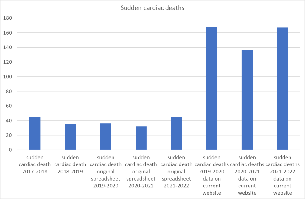
There was still a massive rise beginning from 2019-2020. The size of the rise is not compatible with how many people were dying in total in that time. It is also not compatible with the rise in cardiac arrest calls to ambulances which began in spring 2020 but was substantially higher from spring 2021. Again, note that this is hospital death data, not including out of hospital deaths.
Astoundingly, I found that archived versions of the same data from the NHS website differed drastically from the current version. The original publications for the years from 2019 onwards bore no resemblance to the current records. This shocking discrepancy in data representation necessitates an immediate explanation!
The same graphs as above drawn with the cached versions of the spreadsheets look like this. (The original data for each period is available at these links: 2019-2020; 2020-2021; 2021-2022).
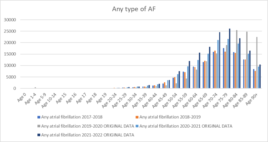
For any type of atrial fibrillation there is now a clear rise from April 2020 compared to before April 2019 in every age group. The data for April 2019-April 2020 looks anomalous with far lower rates in the under 60s and far higher rates in the over 80s. The anomaly disappears when looking at all heart rhythm disturbances. Now the impact of people not attending healthcare during lockdowns is clear.
The sudden cardiac death chart looks more reasonable but is quite noisy as there are small numbers each year.
To compare years it is easier to look at the total for all age groups.
Such a vast contrast in two data sets ostensibly presenting the same information fosters confusion and mistrust. It is simply unacceptable and leaves us questioning the credibility of such crucial data. Are we to remain at the mercy of ambiguous data manipulation while the truth remains veiled? This unsettling state of affairs calls for immediate transparency and accountability.