

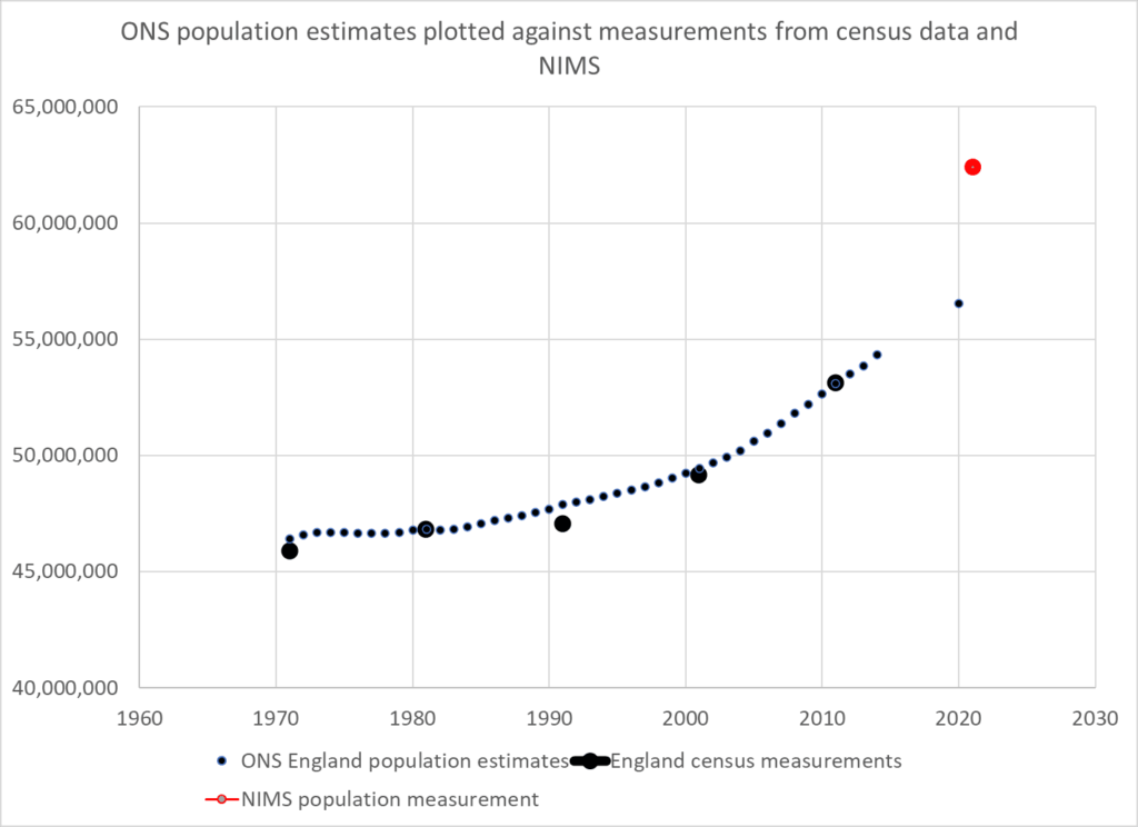
Alternative population measurements concur with NIMS – ONS is a major outlier
The difficulty with assessing how well the vaccines work in the real world is mainly related to the difficulties of estimating the size of a population. There are places where measuring the population is much easier than the UK. For example, it is much easier to measure the size of a smaller population especially in a confined space such as on an island like Gibraltar. That is why soaring case rates in Gibraltar, which claims to have vaccinated almost every adult, is causing such concern.
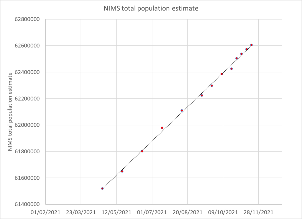
Government rely on ONS data which is modelled from the 2011 measurement and the National Immunisation Management Service (NIMS) which is a database of people registered with a GP and resident in the UK. Those who are not registered with an NHS number are not counted. Both are flawed: the ONS because of the decade since the last measurement was undertaken and NIMS because it does not claim to be able to count the whole population.
Is there another way we could estimate the size of the population?
Three methods are presented which all result in similar answers. As one method relies on death data the examples given are for the over 50 years age group.
Method 1 – estimating the size of the uncounted population
If a patient is not registered with an NHS number and not in the NIMS system they may still get tested for covid. UKHSA publishes positive test results from such people as “unlinked”.
Unlinked case numbers are significant, with more unlinked cases in weeks 42 to 45 than unvaccinated in the over 50s. However, the proportion in this category shrinks in the hospital data and is almost zero in the death data indicating that these patients were linked as they were processed through the healthcare system.
If we assume the unlinked are in fact unvaccinated (and therefore not in the system) then we can calculate the unvaccinated population that are missing from the NIMS system. Using the case rates per 100,000 in the unvaccinated and case numbers in the unlinked, a population can be derived. Data from the latest vaccine surveillance report was used to calculate the missing population in this way and this was added to the NIMS total to give an overall total population estimate.
| Total population | Method 1 – estimating uncounted | NIMS | ONS |
| 50-59 | 9,149,674 | 8,305,807 | 7,637,133 |
| 60-69 | 7,087,001 | 6,368,066 | 5,981,113 |
| 70-79 | 5,438,803 | 4,972,066 | 4,824,120 |
| 80+ | 3,022,541 | 2,805,338 | 2,855,599 |
Is there a way we could cross check this result?
Method 2 – population growth
Between the two measurements of the 2001 and 2011 census the population of England grew on average 0.78% per year. ONS predicts that the rate of growth has slowed since 2011 to 0.68% a year.
A more recent estimate of population growth can be estimated from the NIMS dataset. When new people first encounter the NHS they are added to the NIMS database. The rate of addition has been very steady for the period during which it was published (weekly from April 2021 onwards) and amounts to an increase of 2.9% per year.
A total population was estimated using the 2011 measurement and an annual 2.9% growth rate and the total was then distributed using the 2011 census age distribution.
| Total population | Method 1 – estimating uncounted | Method 2 – population growth | NIMS | ONS |
| 50-59 | 9,149,674 | 8,742,820 | 8,305,807 | 7,637,133 |
| 60-69 | 7,087,001 | 6,847,045 | 6,368,066 | 5,981,113 |
| 70-79 | 5,438,803 | 5,522,545 | 4,972,066 | 4,824,120 |
| 80+ | 3,022,541 | 3,269,026 | 2,805,338 | 2,855,599 |
Method 3 – Death ratios
Although living in the UK without an NHS number is an easy way to remain uncounted it is much harder to die unnoticed. By measuring total deaths in the vaccinated and unvaccinated population in each age group it is possible to estimate the proportion of deaths in the unvaccinated.
UKHSA publishes the numbers vaccinated by age group each week. These numbers increase when a new record of a vaccination is included. However, the numbers often decrease. It is assumed that these decreases are due to people dying. In theory, each age group is a cohort and when people die they should be replaced by others having a birthday. However, UKHSA do not do this adjustment every week, instead they pull the younger age groups up only intermittently. Therefore between the birthday adjustments deaths in the vaccinated can be counted.
The data is presented by vaccination date and where the numbers rise for a particular week these have been ignored; only falls are counted. Some deaths could have been cancelled out by new vaccine registrations so the likely count is an underestimate of deaths in the vaccinated.
The deaths in the vaccinated are compared to total deaths for each age group to give deaths in the unvaccinated and the percentage of deaths in the unvaccinated can then be calculated. A minimum value for the percentage of deaths in the unvaccinated was found for each age group. This minimum was used to calculate the percentage of the total population who was vaccinated and from that the size of the total population was calculated based on the number vaccinated in weeks 16 and 46. The mean of the two population estimates was taken. The minimum for each age group was August -September for older age groups when Covid deaths only accounted for 10 to 15% of deaths. However, vaccination was still ongoing in younger age groups such that a stable estimate of death was not possible until later weeks.
| Age | Percentage of population who are vaccinated based on week with minimum unvaccinated deaths |
| 50-54 | 74 |
| 55-59 | 85 |
| 60-64 | 80 |
| 65-69 | 83 |
| 70-74 | 91 |
| 75-79 | 89 |
| 80+ | 88 |
Using this methodology the population estimates for the over 50s were:
| Total population | Method 1 – estimating uncounted | Method 2 – population growth | Method 3 – death ratios | NIMS | ONS |
| 50-59 | 9,149,674 | 8,742,820 | 9,123,050 | 8,305,807 | 7,637,133 |
| 60-69 | 7,087,001 | 6,847,045 | 7,095,201 | 6,368,066 | 5,981,113 |
| 70-79 | 5,438,803 | 5,522,545 | 5,243,623 | 4,972,066 | 4,824,120 |
| 80+ | 3,022,541 | 3,269,026 | 3,037,688 | 2,805,338 | 2,855,599 |
The estimates are almost all larger than ONS and NIMS with the exception of the 70-79 year old age group when estimated from census data. There are more people vaccinated in this age group than the ONS estimates exist.
The first and third methodology, despite being based on entirely different data, produce a result within 0.5% for three of the age groups but within 4% for the 70-79 year old age group. The population growth methodology is of the same ballpark but with estimates within 5%.The result is a population 8-11% higher than the NIMS measurement.
Implications
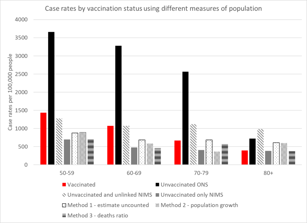
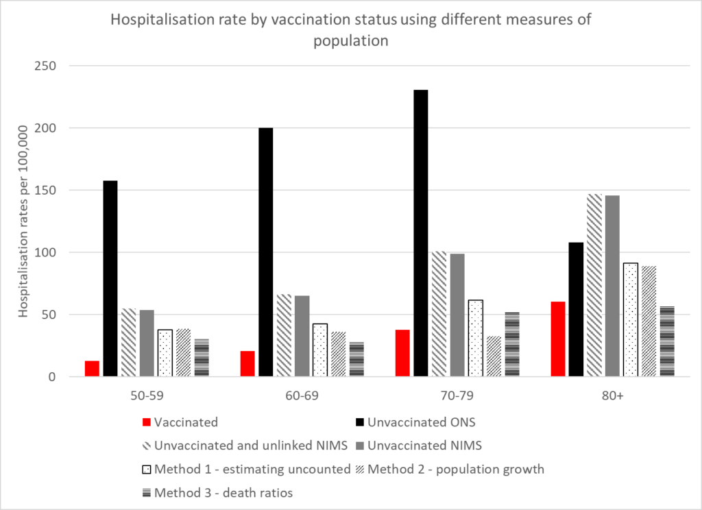
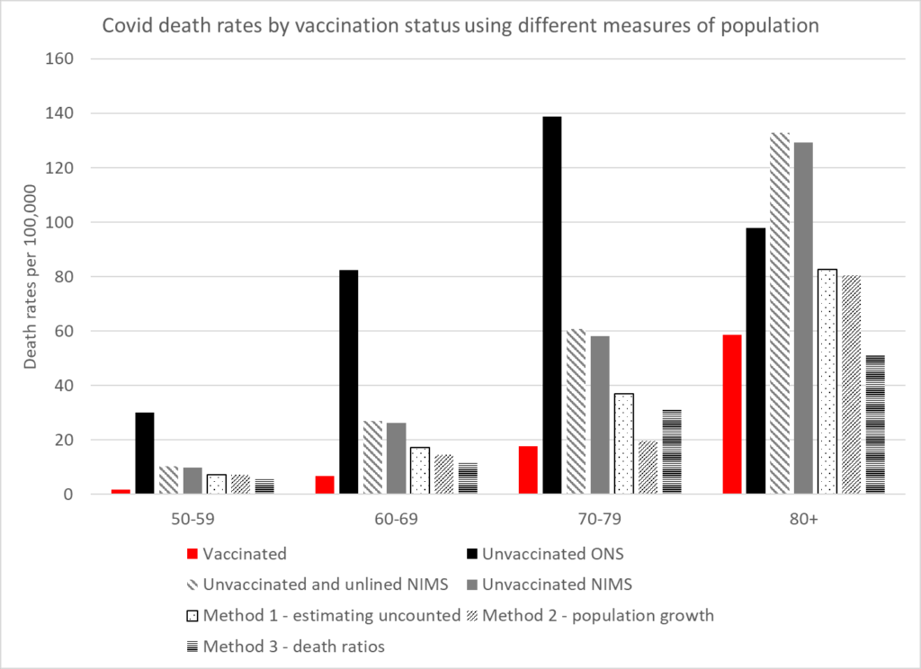
The rates for cases, hospitalisations and deaths can be compared in the vaccinated and unvaccinated using these different calculations of the population. The following graphs show the rates. Two rates have been given for NIMS. The first uses both unvaccinated and unlinked cases as the numerator to allow comparison between the different population measures. The second uses only the unvaccinated as that is the measure within that system which does not claim to have counted the whole population.
These show that the benefit of vaccination in the real world has been greatly exaggerated. The higher case rates in the vaccinated may well reflect that population having a lower level of naturally acquired immunity. A residual benefit against hospitalisations and deaths remains in the younger age categories but there is none in the older ages.
Conclusion
In order to analyse and monitor the pandemic it is critical that an accurate population estimate is available. No one estimate will be perfect, but using a variety of methods to estimate the overall population means that more trust can be placed in those estimates with concurrent results. Underestimating the total population could account for why claims of vaccine effectiveness in the real world are not supported by evidence of fewer hospitalisations or deaths during seasonal waves as has been seen in Eastern Europe and increasingly in Western Europe. Real world evidence also demonstrates the significant biases found in studies purporting to show vaccine efficacy.