

The Canadian result survives even when every province is given the wrong outcome
Dr Clare Craig
| Key points One paper from Canada claims a 46 percent fall in neural tube defects after folic acid was added to flour. It also claims that the provinces with the highest rates before folic acid saw the biggest falls and said that was evidence that folic acid caused the fall. If the seven provinces are randomly assigned each other’s outcomes the correlation remains at 0.95. This is true for all 5,040 possible arrangements. The graph they used plotted the starting rate on one axis against the starting rate after subtracting the finishing rate. The starting rate has a disproportionate impact on the latter such that the two axes are effectively plotting starting rate against starting rate and therefore producing a strong correlation. The finishing rates varied by only a third as much as the starting rates which is why the latter dominates. |
Another article addresses the NEJM 2007 paper claiming Canadian neural tube defects fell by 46 percent after folic acid was added to the flour. The main figure is a before and after comparison with no control group to compare. To show causation rather than just correlation de Wals and colleagues reported that the size of the fall in each province was proportional to how high that province’s rate had been beforehand. The implication was that those with more of a problem benefitted the most. It is based on the idea that neural tube defects are caused by a folate deficiency and that adding it to flour brings women to a healthy level.
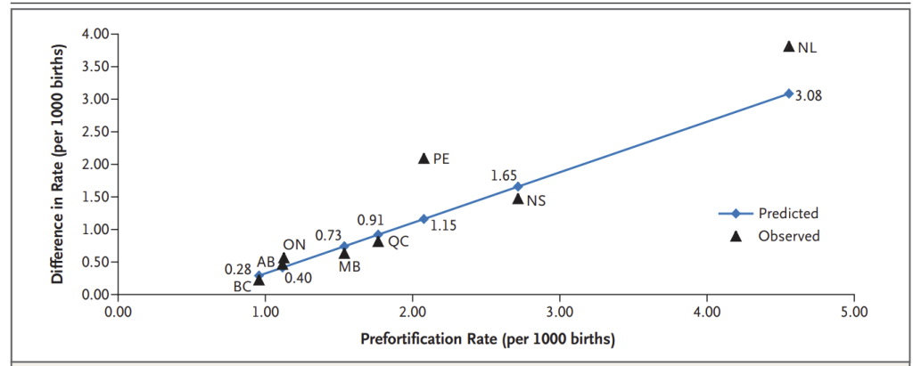
Figure 2 of the paper showing the strong correlation between the fall in the rate and the starting rate
Testing the correlation
If there was a true correlation then randomly assigning the rate after fortification to different provinces would make the correlation substantially weaker or even fall apart. Give Newfoundland’s result to British Columbia, British Columbia’s to Quebec, and so on. Those with a low starting rate might end up with a high fall and those with a high rate might have a low fall. That is not what happens.
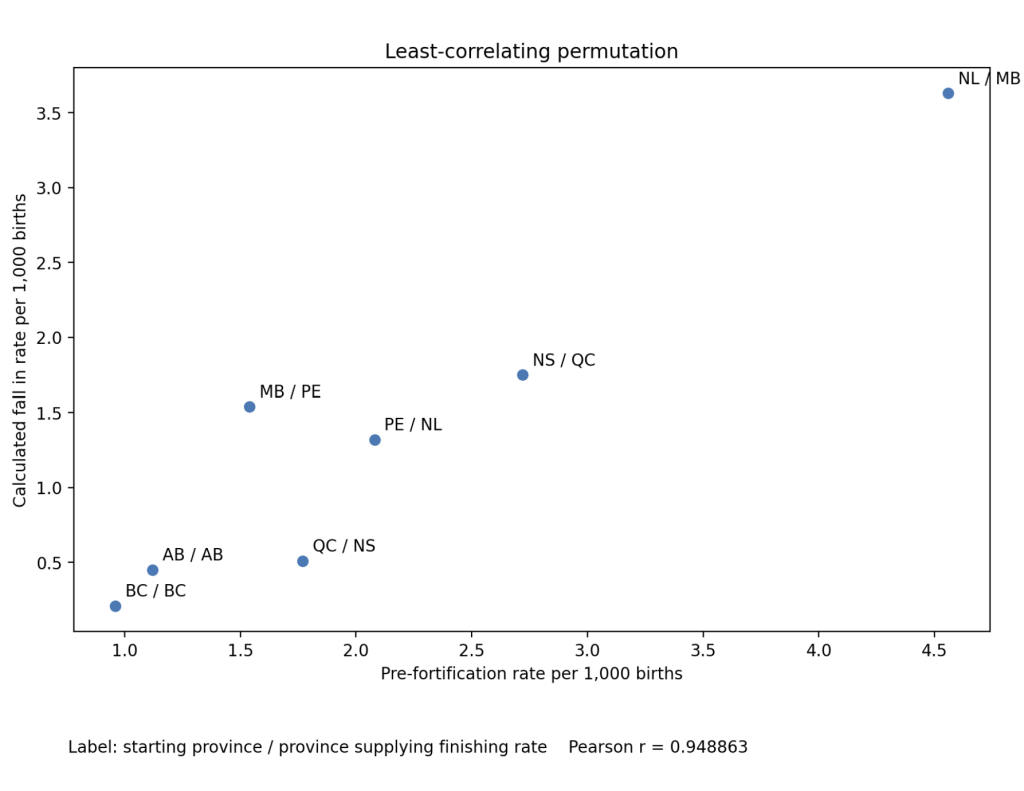
In all 5,040 possible arrangements the correlation stays at 0.949 or above. Putting the real data in gives 0.951, where 1 would mean the two quantities were perfectly related to each other so the same increase in one was always matched by an identical increase in the other and 0 would mean no relationship between them at all. Of all the possible random combinations, 62 percent gave a stronger correlation than the actual data.
The same number is on both axes
The x-axis of Figure 2 shows each province’s rate before fortification. The other plots the fall in the rate i.e. the rate before fortification minus the rate after it. So the starting rate is a part of the number plotted on both axes. Plotting a difference against one of its own components is not always misleading. What makes it misleading in this case is the small size of the number being subtracted.
Before fortification the provincial rates ranged from 0.96 to 4.56. Afterwards they were compressed into a range of 0 to 1.26. Each plotted difference in rate comes from a starting rate which varied widely with a comparatively small number subtracted from it. If we randomly allocate those small numbers, little changes.
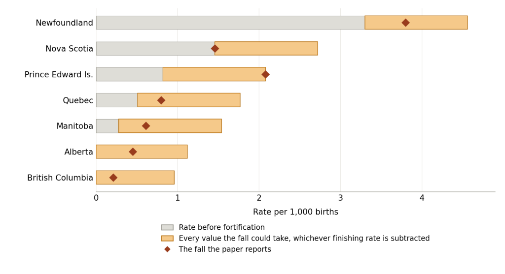
Figure 1: Rate of neural tube defects in Canadian provinces. Each grey bar is a province’s rate before fortification. The shaded band shows the full variation in the size of the fall when each provinces’ end result is randomly allocated. The diamond marks the actual fall. Rates from De Wals and colleagues (2007), Table 4.
For example, Newfoundland and Labrador recorded 4.56 per 1,000 before fortification and 0.76 after. The fall is therefore 3.80. Subtracting even the largest finishing rate in the study leaves 3.30, which is higher than any other province’s rate before fortification. Newfoundland holds the right-hand end of the graph under every one of the 5,040 arrangements. Lower down the bands overlap more. The random allocation can cause provinces to change order but not by much. The maximum change is only 1.26. The variation in the falls is inherited from the starting rates.
The combination with the lowest correlation looks like this:
As an analogy, imagine seven candles of very different heights. They are burnt down to stubs. Each candles starting height is then compared to the amount of height lost. It wouldn’t matter how you muddled up the stubs — you would still see a correlation where the tallest candle was plotted with the greatest loss and the shortest with the least.
What the graph really shows
The provinces started with rates that were far apart and finished with them close together. This kind of convergence has more than one possible cause. A genuine benefit reducing the rates is only one possibility. Regression to the mean is another: a province recording an unusually high rate in one period will tend to record something nearer the average in the next as outliers tend to be rare.
The line on the graph has been offered as a way of predicting the scale of the benefit from folic acid fortification in another country but it is incapable of doing that.
The zero level that came from China
The line the researchers fitted hits zero benefit when the starting rate is 0.6 per 1,000. That was not extrapolated from the data collected in Canada. The Methods state that the model was constrained based on the assumption that no reduction is possible where the starting rate is 0.6 per 1,000 or less. This figure came from a study of Chinese regions.
The scientific evidence that forms the basis of the claim of folic acid efficacy is flawed in many ways.