Another look at the impact of the covid ‘vaccines’
The benefits claimed from the covid injections (now reduced to an assertion that they prevent severe disease and deaths – claims that infections or transmission are reduced having been jettisoned) are heavily dependent on a measure of the number of deaths per case. Unfortunately, due to inconsistencies in the way “cases” are measured this data has to be taken with a pinch of salt. Furthermore, there is no historic data on how data on cases changed over time for previous respiratory viruses. Having a disproportionate number of cases per deaths for a third wave of an influenza variant might be the norm. No-one knows. All that we do know is that historically waves of hospitalizations and deaths for influenza have been of a similar size and duration each year.
Joel Smalley has analysed the data from Florida and has broken it down by age group. Here are the death curves for the over 65s in Florida. It is a repeating pattern.
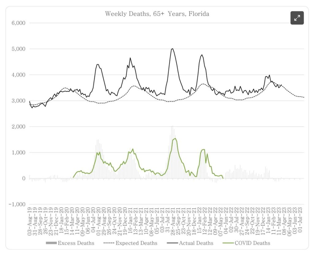
Figure 1: Deaths in Florida for over 65 year olds. Total deaths (black line) over the baseline (dotted black line) at the top and covid deaths (green) with the weekly excess deaths in grey bars.
Compared to recent years caused by other respiratory viruses there were more deaths in these waves attributed to covid.
Somehow people believed the lie that the fall from the beginning August 2020 was due to lockdown and the fall from January 2021 was due to injections. However, the same people accept that the fall from August 2021 and January 2022 were both natural events. It is hard to reconcile those beliefs. Clearly, the timing of the earlier peaks was the same time of year as the later ones suggesting a natural peak occurred with each wave. It becomes very hard to see a injection benefit of any kind given the equivalent size and duration of these death waves before and after injection. The official claim is that the third wave would have been close to 20 times larger in the absence of injection in order for the injections to have been 95% efficacious against death. That is an extraordinary claim.
Having established the impact covid had in Florida on the more vulnerable over 65 year olds we are ready to look at the impact on younger age groups. Here are 25-44 year olds.
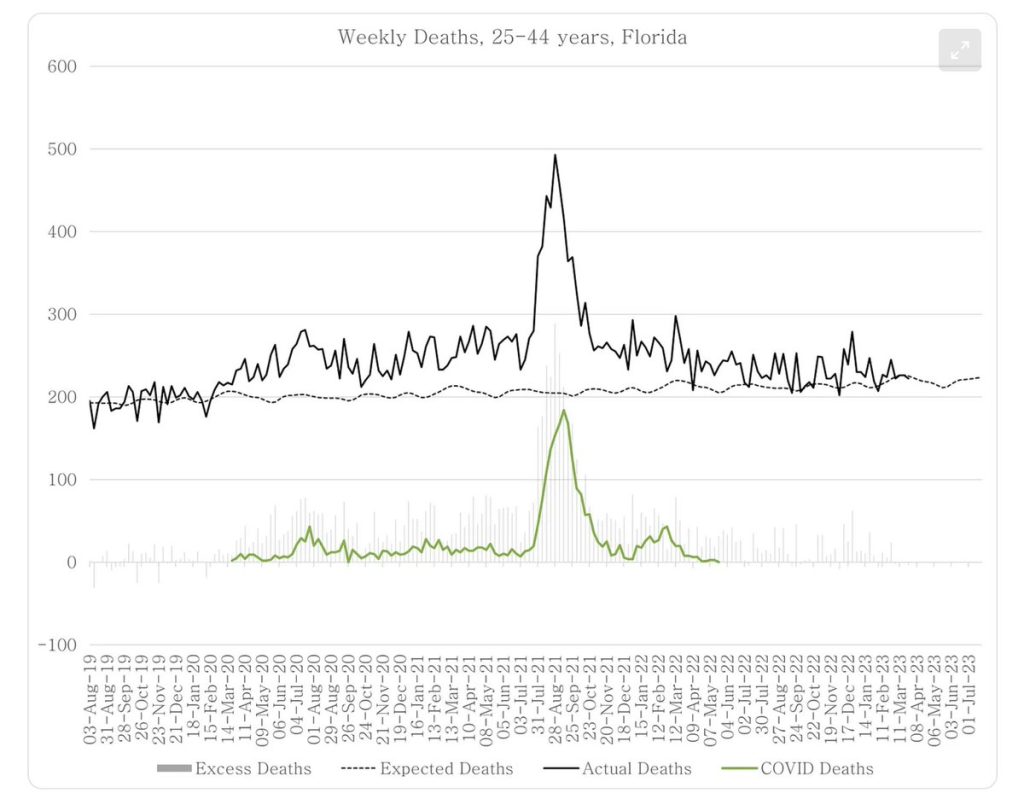
Figure 2: Deaths in Florida for 25-44 year olds. Total deaths (black line) over the baseline (dotted black line) at the top and covid deaths (green) with the weekly excess deaths in grey bars.
Covid had minimal impact on this age group. A small July 2020 peak is evident but no January 2021 or January 2022 peak is seen. Instead, there was a rise from lockdown but it’s a plateau not a wave. Then there’s the dramatic death spike in summer 2021.
The official story is a combination of:
1. There were more cases for Delta
2. Delta was more deadly in the young
3. It was the uninjected young who were dying
The first is reliant on the case data which is not a reliable measure as it is subject to testing rates, reporting rates and how the testing is carried out. The second depends on the idea that relatively minor changes to a virus can dramatically change its biology. There is not good evidence that such mutations have caused any major change in either transmissibility or deadliness let alone the pathology it causes. For example, comparing transmissibility over the course of a whole wave shows that the proportion of contacts becoming infected was similar for every variant. Omicron was indeed less deadly but had numerous mutations of the spike protein which did change its pathology. Even Omicron did not result in a different death rate for different age groups. Thirdly, the claims of deaths being in the uninjected were heavily skewed by many patients whose injection status was not recorded being assumed to be ‘unvaccinated’; by the first two weeks after injection being classified as ‘unvaccinated’ and by an underestimation of the size of the uninjected population.
Importantly, by May 2021, nearly 30% of 25-44 year olds had been injected.
That is a huge proportion and you can bet it included all – or nearly all – of those who were at risk of dying from covid.
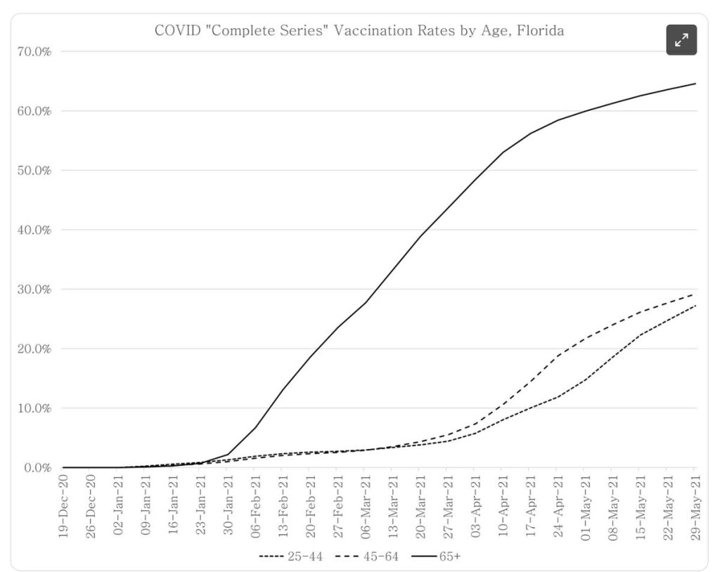
Figure 3: The total percentage of each age group to have received an injection in Florida
So why did the young in Florida die, right at the time when they were being injected?
Unlike in the UK, Florida injected young people at a time when there was a marked wave of covid. Filling the body with synthetic spike keeps the immune system very busy. During that time it is not able to do its day job properly. We know this for a variety of reasons.
First, Pfizer reported on the impact on one type of white blood cell, in the first few weeks. After a week it had recovered but it certainly fell and we don’t know how low.
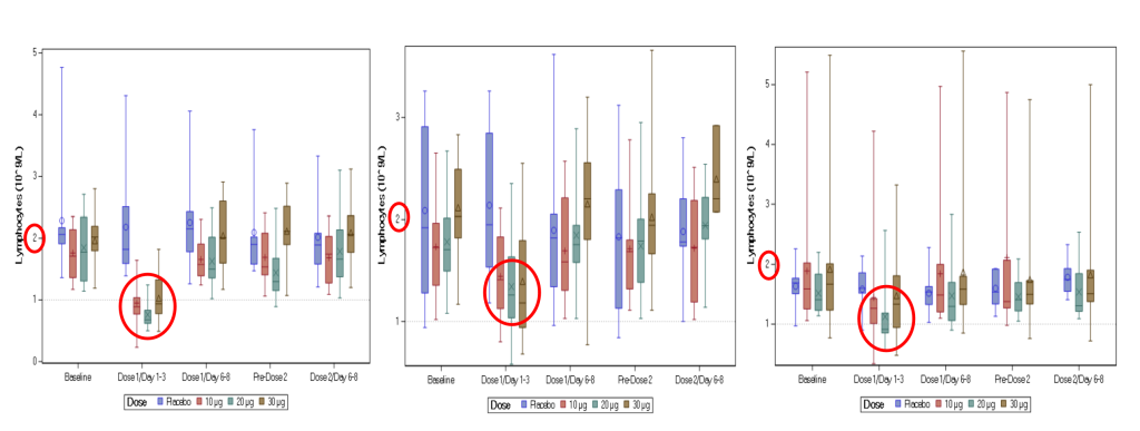
Figure 4: The count of the white blood cells, lymphocytes, in the blood in patients injected with the Pfizer product at different periods before and after injection. The left graph shows a molecule that was rejected for having to severe an effect. The others show the molecule used (central graph 18-55 year olds and right hand side 65-85 yr olds). The measure at day 1-3 was still low and it is not clear how low it went before that measure.
There is other evidence of the impact – like the high rates of shingles and the ~40% higher rates of covid infection in the first two weeks after injection.
If the Delta wave really would have caused substantially more deaths in the absence of covid ‘vaccination’ then we would have seen huge Delta waves in low ‘vaccination’ countries.
Take, for example, South Africa where only 10% were injected by Aug 2021. The waves were of a similar magnitude and deaths from Omicron much rarer. This was true for both covid labelled deaths and excess deaths.
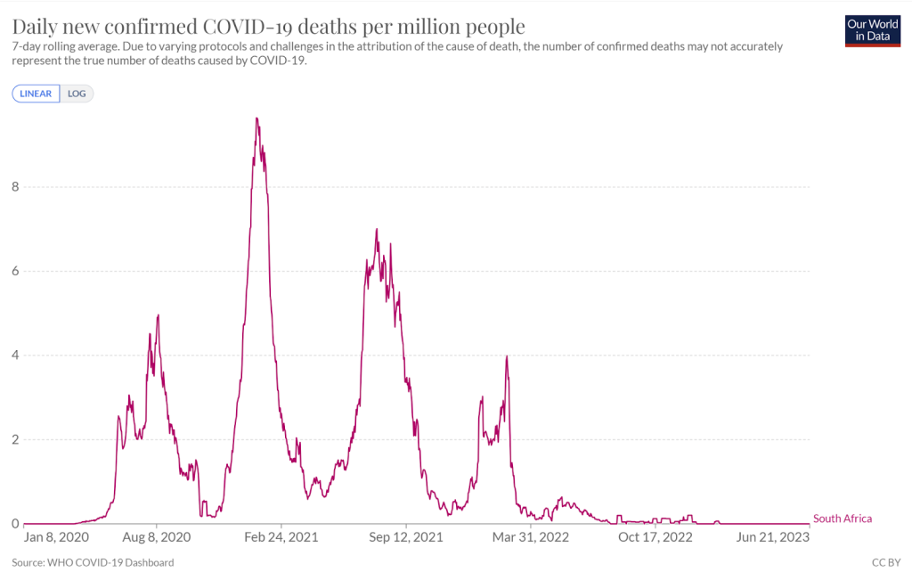
Figure 5: Covid attributed deaths in South Africa
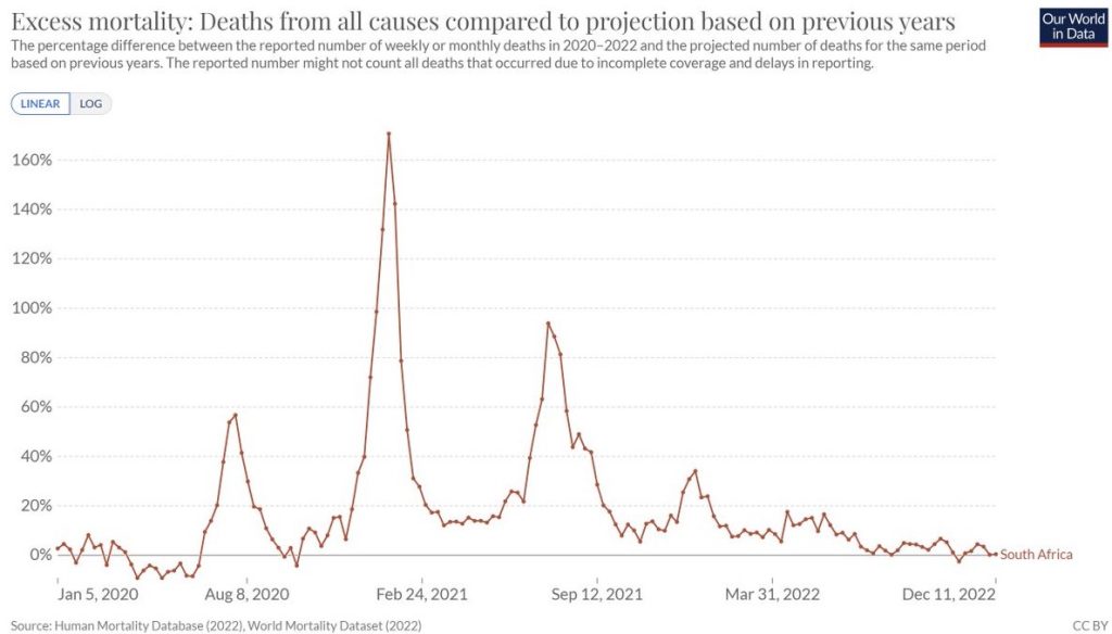
Figure 6: Excess deaths as percentage of baseline in South Africa
Another example would be Palestine, which can be compared to Israel. Palestine had larger waves of excess mortality in the pre-injection and post-injection waves but within each country the waves were of similar magnitude over time. By September 2021 only 20 percent of Palestinians were injected compared to 64 percent of Israelis. The lower excess deaths in Israel is likely due to having had high numbers of deaths earlier on as the covid labelled deaths had a similar dimension regardless.
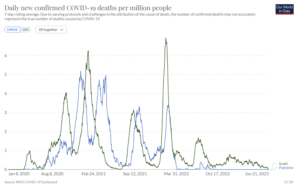
Figure 7: Covid labelled deaths in Israel and Palestine
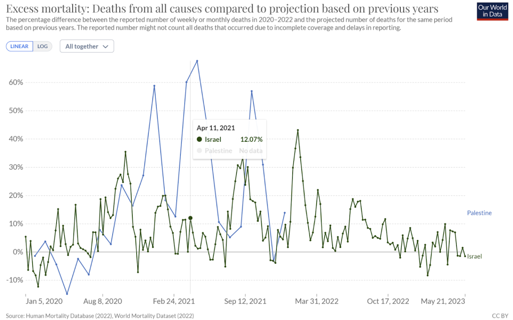
Figure 8: Excess deaths as percentage of baseline in Palestine and Israel
A further example would be Bahrain and Oman – two nations in the Arabian peninsula that fared worse than others. Both are heavily vaccinated but the timing was markedly different. Bahrain went early and had vaccinated half their population by the end of April 2021. At the beginning of June 2021, Oman had only vaccinated 7% and did not reach 50% of the population until mid-August. A large Delta wave surged in Bahrain with vaccine rollout in May 2021 but did not affect Oman until June. Ultimately, the lack of vaccination in Oman until summer had no detrimental impact. (Excess death data is not available for Bahrain).
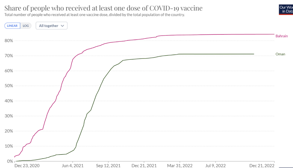
Figure 9: Percentage of population vaccinated in Bahrain and Oman
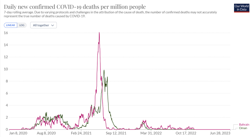
Figure 10: Covid attributed deaths in Bahrain and Oman
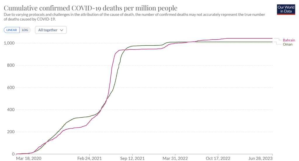
Figure 11: Cumulative covid attributed deaths in Bahrain and Oman
The claim that covid injections saved lives does not stand up to any scrutiny.