
A refined way to accurately measure the problem
Also available on Substack – Come and join the conversation with open comments
Joel Smalley has carried out extensive analysis on a dataset which has allowed for the most accurate excess death data so far produced.
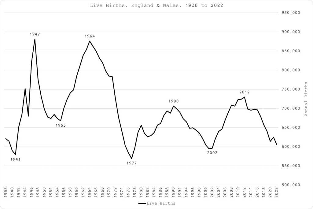
There is a huge, previously unaddressed issue, of grouping cohorts when calculating excess deaths. There is huge variation in the size of the cohorts born each year. When looking at deaths by age, there can be huge variation year to year (see figure 1) in how many people are in that grouping depending who is leaving or arriving into that age band. The errors compound over a 10 year grouping. This has a direct impact on the number of deaths that should be expected. The result is that the accuracy with which expected death numbers can be predicted has wide confidence intervals.
After being refused access to the necessary data, Joel Smalley paid to get data by single year of age at death, from which he could derive the birth year from the ONS. This allows a single cohort to be followed up over time. The tricky challenge is that as time progresses we are more likely to die and this needs to be factored in too. Finally, as the number left to die reduces there comes a point where deaths in a cohort peaks and starts to fall. Thankfully the mathematics of our likelihood of dying is very neat and relatively easy to model. Over time there is a constant increase in the rate of growth of our risk of dying. Also over time the number of people remaining who can die decreases. The result is the classic Gompertz curve which was in fact originally described based on this mortality observation. Figure 2 shows the Gompertz curve from this ONS data (data for the over 90 year olds was not provided by single year of age).
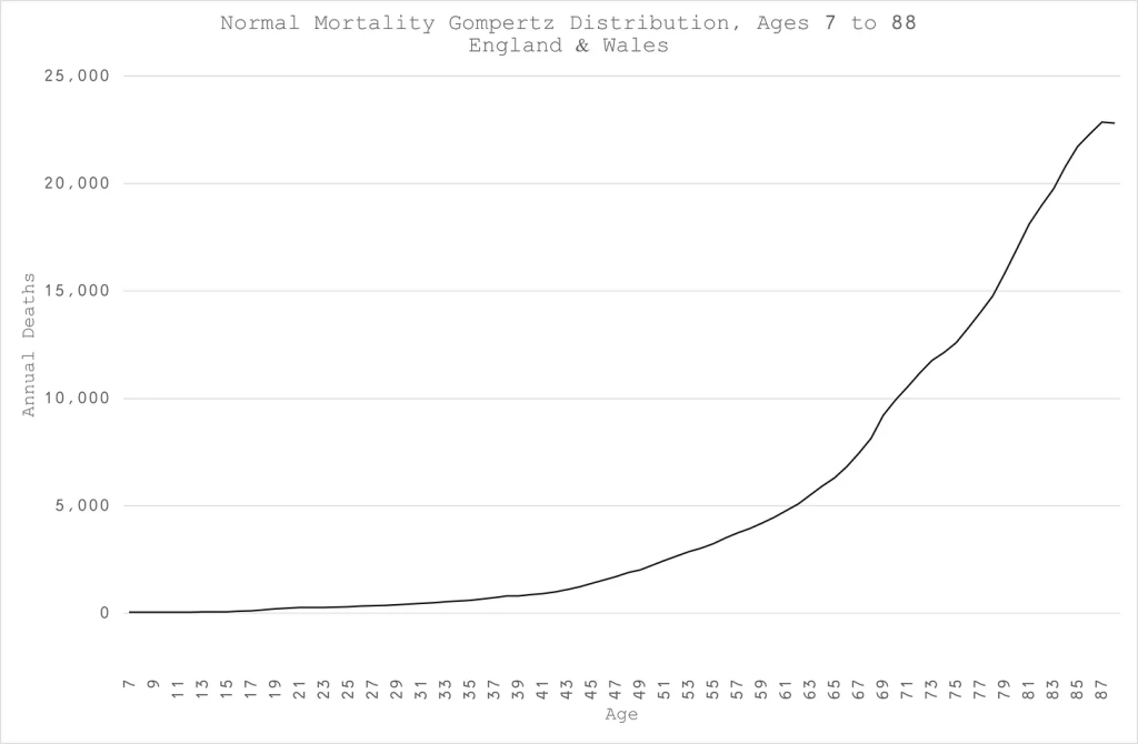
Plotting this distribution incidentally revealed two age groups with higher deaths than would be expected for their age alone. The first was in young men whose risk was that of those ten years older and the second was among those aged about 68 to 75 years old.
Using this Gompertz it is possible to take any one cohort by year of birth and predict how many deaths there should have been over the last few years. The size of the cohort can differ but the growth in the number of expected deaths stays constant. Using this refined baseline the excess death issue can be very accurately measured for each age group.
Any claims that the excess is due to changes in the overall age of the population therefore become moot.
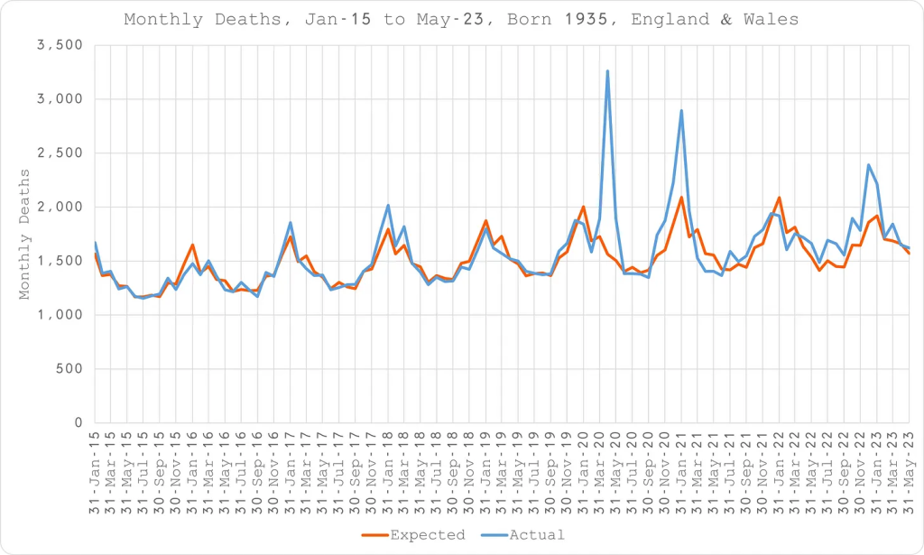
Figure 3 shows the plot for those born in 1935. In orange their expected deaths are shown, complete with a seasonal spike. In blue the actual deaths were shown including the abnormal spring 2020 spike in deaths, an autumn rise, a further January 2021 spike and then a return to expected levels before the last spike in winter ‘22/’23.
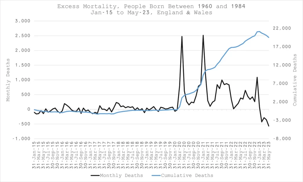
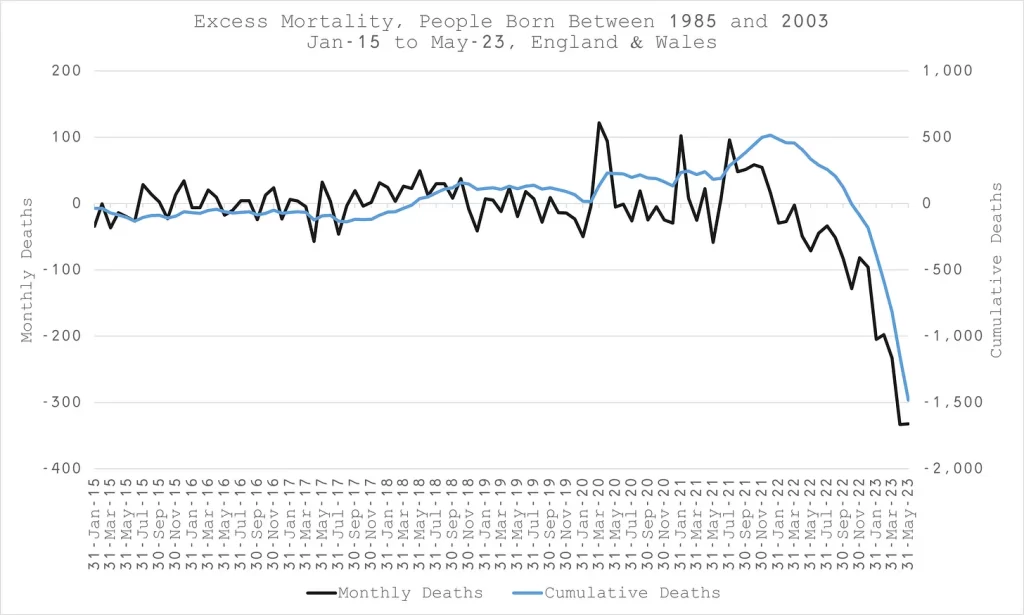
Using the methodology above the excess death for each year group can be added into a total for a range of age groups. These have been plotted in black in figures 4a-4d. The blue lines show the cumulative excess on the right hand axis. The last couple of months fall away because of a data lag – not all the deaths have been included yet.
What is notable here is that there seems to be a move of the baseline after vaccination whereby there are excess deaths at a constant rate once vaccines have rolled out. There were two periods where there was an exception to that, in spring 2021 and in early 2022. In the first case this was likely a consequence of people dying a few months earlier coincident with covid and the vaccine rollout such that people who would have died in spring were already dead. The second period was a period where there were far fewer than usual respiratory deaths for a winter period and consequently fewer overall deaths from all causes.
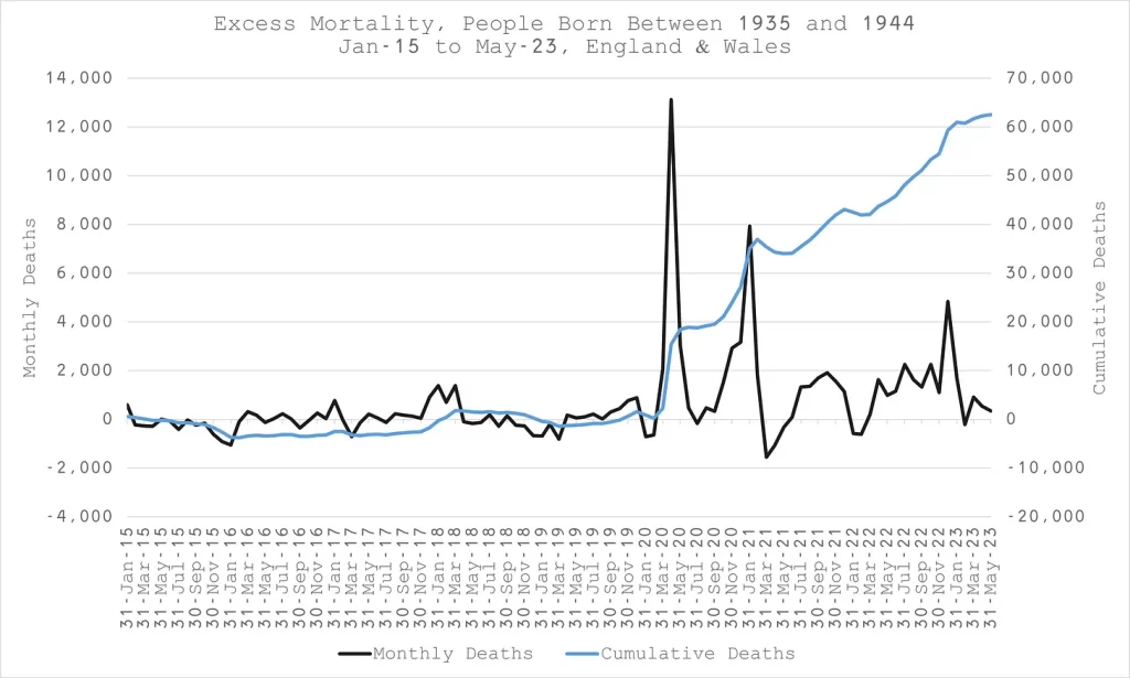
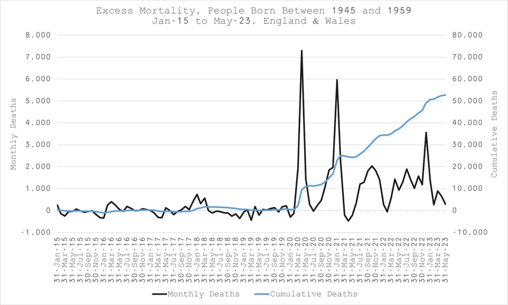
N.B. The blue line is not a baseline, it is a cumulative excess – the excess is anything above zero.
Finally, the youngest age group (aged 17 to 35 yrs in 2020) shows a different pattern (Figure 4d). There were two spikes during the first lockdown. However, no excess was seen after May 2020 nor in autumn 2020. The next spike coincides with arrival of vaccines and the Alpha variant. (A surprising number of this age group were injected from January 2021 before recommendations from the JCVI and it was likely the most vulnerable who were targeted as well as health and social care workers). The third spike clearly occurs with the wider vaccine rollout and the start of the Delta wave and stays above zero for the rest of the year. It is hard to interpret the later figures, as this age group has the greatest data lags with a high proportion of deaths being investigated by the coroner and the data not collected by ONS until afterwards.
Joel Smalley’s more refined baseline allows for a much clearer view of excess mortality for each cohort and demonstrates a consistent pattern of excess since vaccine rollout. Importantly, there was no impact of covid itself or restrictions on mortality of 17-35 yr olds in autumn 2020, which begs the question of why they needed vaccination.
Joel has since found a more extensive dataset including mortality data going back to 1965 and will be refining this analysis further – so watch this space….