Percentage of susceptible people remains same year on year
All HART articles also on Substack. Please consider a PAID SUBSCRIPTION so we can continue our work. Comments are open so you can join in the conversation.
Before Public Health England became UKHSA they devised a way of measuring the proportion of household contacts who were ill a few days later – the secondary attack rate. Many publications on secondary attack rates claim very high percentages but fail to exclude people within a household who became ill at the same time as each other and should both be considered primary cases. Public Health England did exclude these situations and found very consistent results as a consequence.
Will Jones, editor of the Daily Sceptic observed that the secondary attack rate would always be higher at the beginning of a wave and lower at the end. This enabled a continuing cry that every new variant was more transmissible.
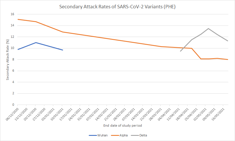
The only meaningful measure of what proportion of the population were susceptible to each wave is therefore the measure at the end of the wave. It is a very important measure because it tells you the upper bound for the proportion of the population who could have been infected by any particular variant.
| Secondary Attack Rate | PCR positive cases as % of population (England) | % of population who developed post infection antibodies | |
| Wuhan variant(up to end June 2020) | 11% | Inadequate testing | 5% |
| Autumn variant(Jul-Dec 2020) | 9.9% | 3.7% | 5% |
| Alpha Variant(Jan-May2021) | 10.2% | 3.6% | 9% |
| Delta Variant(Jun-Dec 2021) | 10.3% | 14.0% | 9% |
| First Omicron Variant(Jan-Feb ‘22) | 10.7% | 7.8% | 18% |
| Second Omicron wave (Mar-May 2022) | Similar at beginning of wave to previous waves | 4.8% | 25% |
| Third Omicron wave(Jun-Aug 2022) | No data | 1.9% | 10% |
The UKHSA publications stopped reporting anything on secondary attack rates after March 2022.
It is clear that a similar proportion of the population were susceptible to each variant. At any point in time 90% of the population were mere bystanders who were not at risk of infection. Despite the very consistent proportion who were susceptible the measure of PCR positive cases varies immensely from less than half of those susceptible to 40% more than the total possible susceptible population. This highlights the major issues with overdiagnosis inherent in the way PCR testing was carried out.
Antibody testing was more constant but also showed low figures early on and figures that are incompatible with the proportion who were susceptible once Omicron arrived.
| ICU admissions in England | ICU admission per 100,000 PCR cases | ICU admissions per 100,000 antibody cases | ICU admissions per 100,000 susceptible people | |
| Wuhan variant(up to end June 2020) | 10,620 | N/A | 382 | 174 |
| Autumn variant(Jul-Dec 2020) | 11,676 | 568 | 420 | 212 |
| Alpha Variant(Jan-May 2021) | 14,678 | 733 | 293 | 259 |
| Delta Variant(Jun-Dec 2021) | 13,900 | 179 | 278 | 243 |
| First Omicron Variant(Jan-Feb ‘22) | 2224 | 51 | 22 | 37 |
| Second Omicron wave (Mar-May 2022) | 1946 | 73 | 14 | 35 (assuming 10% susceptible) |
| Third Omicron wave(Jun-Aug 2022) | 1668 | 158 | 30 | 30 (assuming 10% susceptible) |
Using the different measures of cases results in huge variation in the estimates of ICU admission per case. Interestingly, the percentage who were susceptible gives very consistent results for pre-Omicron and Omicron. In contrast the figures using other measures shows huge variation in a way that is not biologically plausible.
The secondary attack rate exposes the reality of how few people were at risk at any one time and the inaccuracy of both PCR and antibody testing. Perhaps it is no wonder publication stopped 20 months ago.