

Hiding part of the data leads to wrong conclusions
There have been numerous papers published showing how well the vaccines protect people after the second dose. Some of this effect is an illusion. The effect happens as a result of inaccurate measuring and a phenomenon called survivorship bias.
Survivorship bias happens when a group is compared at two time points, but the members of the group change between the time points. It would be like assessing the quality of a swimming school which favours the technique of throwing people into the middle of the ocean, leaving them for a couple of hours and claiming credit for how well the remaining students can swim. After two hours, the only people left would be the ones who could already swim and possibly a few who learnt to swim the hard way! The poor souls who drowned in the interim don’t even make the count. Attributing the remaining people’s swimming ability to the coach who turned up 2 hours later would obviously give a very misleading picture. Pointing out that no-one drowned in later lessons would be equally misleading in determining the success of the ‘teaching technique’.
With covid vaccination there is a two week period after vaccination that is not included in the data. The rationale given for this is that vaccines take a while to induce antibodies and therefore the first two weeks’ data are not relevant. Obviously this is flawed. What if the vaccines have deleterious effects that are visible straightaway, that have nothing to do with antibody production? An example is the high rate of shingles seen after covid vaccination, suggesting there is a problem with viral reactivation. This may explain why Sars-CoV-2 infection rates are actually higher in the vaccinated than in the unvaccinated in the first two weeks after vaccination.
The effect of eliminating the first two weeks is a misleading data bias. If people become infected and are dying during that period, this needs to be included. The possibility that the vaccine itself may exert an effect on infection rate cannot be overlooked and the entire dataset needs to be included in order to accurately assess effectiveness. By only measuring the period after the higher risk of infection (0-14 days) it is possible to be deceived. Any signal would be missed.
Aside from it being nonsensical in terms of individual risk to remove this period of time, there will also be an impact on the wider community. If the vaccine in fact causes a spike in infections during the first two weeks, this will inevitably increase spread and will lead to an increased number of infections in that community during that time. Therefore, the assessment of the impact of the vaccination programme must include not only the effect on the individual, but the impact on the wider community.
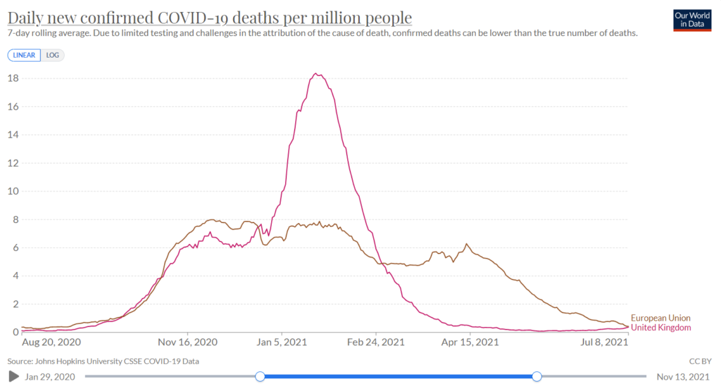
This point is of particular relevance for close-knit communities where many are being vaccinated at the same time, such as schools and in particular communities with a high number of vulnerable people such as care homes and hospitals. What we are effectively doing is ‘speeding up’ the wave of infections (and deaths). Ultimately at the end of the viral season, the same number of people died. Because of excluding the earlier deaths (1-14 days), we are misled into thinking that the vaccines were more effective than they actually were. By only looking at the later period and seeing fewer deaths during that time, the illusion was created that lives were saved. This is evident in data from many countries following vaccine roll-out. The graph below showing the UK versus Europe illustrates this point, as the UK was the fastest to roll out the vaccine. The total number of deaths, represented by the area under the curve, was similar to other countries, but is just compressed into a shorter time period.
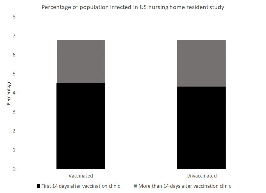
Let’s now examine some specific examples, e.g. this study of nursing home residents in the United States. The results show that over the course of the study 6.8% of the vaccinated population were infected and 6.8% of the unvaccinated population were infected. However, by deciding that the first 14 days after vaccination should be excluded, the grey area for the vaccinated group is compared to the black and grey area combined for the unvaccinated. Doing so could lead to the claim of 66% vaccine efficacy against infection. The authors of this study were honest enough to share the raw data and did not claim 66% efficacy.
However, numerous studies have relied on this trick to make claims of vaccine efficacy. The most obvious examples of this are the original Pfizer trial study and the AstraZeneca trial.
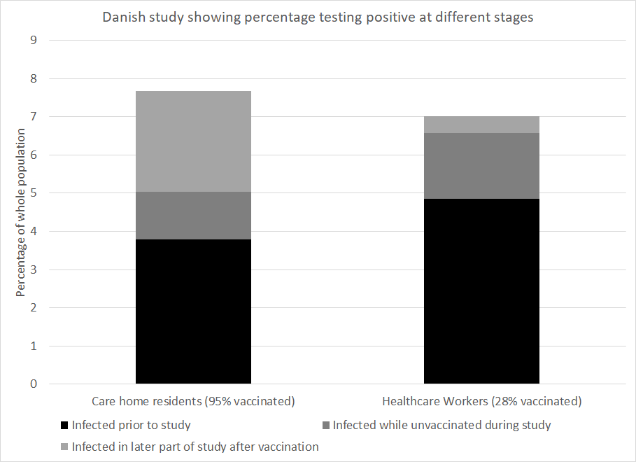
To take a second example, a Danish paper measured infection numbers in healthcare workers and care home residents. Prior to the beginning of the vaccination programme 4.8% of the healthcare workers had been infected and 3.8% of the care home residents had been. The study ended at the end of the Danish winter wave after 95% of the care home residents had been vaccinated and 28% of the healthcare workers had been. Given the worse position at the start and the lower vaccination rate in healthcare workers you might expect that they were worse off overall. However, the percentage infected by the end of the wave was 7.0% among healthcare workers but 7.7% among care home residents.
How much of the vaccine efficacy reported in covid research is really a measure of survivorship bias coupled with naturally acquired immunity? This is a critical question. No claim of vaccine efficacy should be made without first addressing this.