

Analysis of latest Lancet paper promoted by media
Dr Clare Craig
A new Lancet Child & Adolescent Health paper has drawn headlines suggesting that COVID-19 poses a greater myocarditis risk to children than vaccination. A closer look at the data, however, raises serious questions about how those conclusions were reached.
The headlines were that covid was a greater risk for myocarditis in children than the vaccines. There is solid evidence and from multiple sources that this is not true, so how did this reversal happen?
Comparing risks from infection and vaccination is of no relevance when vaccination did not prevent infection. The risks become additive.
The key lesson, that vaccination primes the immune system such that exposure to the virus is riskier has not been learned.
Before we begin there are three key points that mean this kind of analysis based on diagnostic codes in the medical records – even if done honestly – is not a good measure.
- 3% of teenage boys after their boosters had evidence of dead heart cells measured with raised troponin levels in the blood and a third had symptoms.
- It is wrong to focus on only one adverse event to the exclusion of others.
- The vaccines did not prevent infection so it is not an either or sum. Vaccinated children were exposed to more risk.
| Key Issues Selective framing: The studies presented infection as the greater danger, but avoided comparing post-infection risks in vaccinated versus unvaccinated children. Data manipulation: Heavy statistical adjustments and merged age groups diluted vaccine-associated risk. Incomplete datasets: The analyses excluded data beyond 2022, despite evidence of ongoing myocarditis cases. Uneven comparisons: Time frames for infection and vaccination were not aligned, biasing outcomes toward vaccines. Lack of transparency: No raw counts or control checks were shown to validate the models. Focus on younger group: They did not include Moderna doses, nor the people in their 20s who were at highest risk and made no comment on the greater risk after doses 2 and 3 only presenting data for six months after first dose. |
What was the risk?
Two large national studies: one Oxford-led (Nature Communications, 2024) and one UKHSA/Imperial-led (Lancet Child & Adolescent Health, 2025), both analysed data from NHS in England and both made heavy adjustments. The first showed a risk of 4 per million post infection in the unvaccinated whereas the later study, which included the second half of 2022, showed a risk of 22 per million post infection. Why would the risk after infection have risen not fallen when children were vaccinated?
In Nature Communications (2024), the raw data implied roughly 18 myocarditis admissions per million vaccinated adolescents within six weeks of a dose (36+ cases among ≈ 2 million vaccinated 12-17-year-olds- hidden in appendix). If you included those not admitted to hospital it would be higher. If you included those who were not diagnosed it would be higher still. However, after regression adjustment, the authors reported only 3-5 additional cases per million, a downward revision of about three-quarters.
The Lancet analysis, including the second half of 2022 and was based on a larger dataset, had 250 cases post vaccine working out at 19.3 per million for all aged 5-17 years. They too modelled the risk but over six months follow up and they ended up reporting 8.5 per million following vaccination, still higher than Nature’s adjusted figure but diluted by combining age groups.
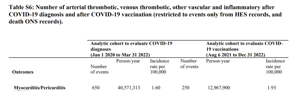
Figure 1: Supplementary table from Lancet paper showing rates per 100,000
The Lancet group adjusted their 1.60 per 100,000 figure for incidence of myocarditis/pericarditis after infection (16 per million) and presented a figure of 22 per million after an infection. This included the period in 2020 when tested children were disproportionately hospitalised for other conditions. It is striking that the vaccine risk and infection risk are so similar.
Were events double counted?
There is a big problem with the data in that table. There were only 371 myocarditis and pericarditis diagnoses in England between March 2020 and April 2023 in under 18 year olds. Where did the 650 events these authors are claiming come from? They simply do not exist in the real world.
Table 2 in the main paper included diagnoses outside of hospital (see figure 2). The apparent total number of cases is twice as high in the post infection group compared to table S6 above. Meanwhile, the post vaccine total is 3.6 times as high. Notably the population years figure used as a denominator in the post infection group has fallen by a quarter too.
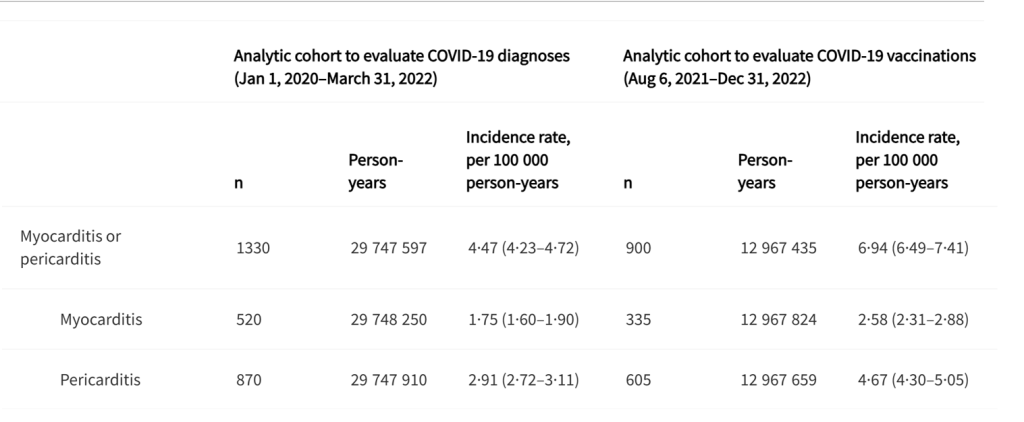
Figure 2 Table 2 from paper showing large numbers of events used to calculate an incidence
The authors combined data from multiple sources but were not able to deduplicate overlapping records across datasets. Table S6 uses only hospital admissions and death records, whereas Table 2 adds data from A&E attendances. Because events recorded in A&E may also appear in hospital records for the same episode, the inclusion of A&E data could lead to some double counting of clinical events. Because Table 2 includes events recorded across multiple healthcare settings without episode-level deduplication, the larger numbers may reflect the total number of healthcare encounters related to an outcome rather than the number of unique clinical events. In this sense, the figures can be interpreted as a measure of healthcare encounters per person, rather than unique incident cases. That would imply the post vaccine cases were seen more often than the post infection ones.
Ultimately, the raw data in this table looks even worse than in table S6. It was the adjustments that got them the headline.
Now, any decent analysis would have presented risk after infection separately for the vaccinated and unvaccinated. You can bet they would have done that if it had looked favourable for the vaccine. They did not. They never do.
Importantly, the risk of infection is low in any one year but 100% of the risk from vaccination is included with every vaccine. They did present some comparison between vaccinated and unvaccinated. Here are the totals for conditions from 2020-2022 in each group. Clearly the unvaccinated have had more time to acquire diagnoses. The overall risk in the vaccinated of myocarditis was four times as high and the risk from pericarditis was three times as high.
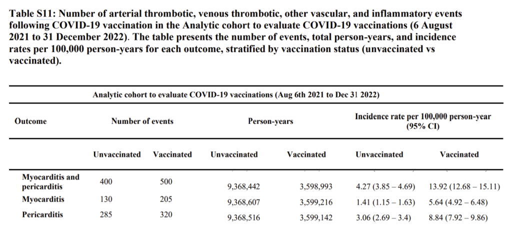
Figure 3 Table S11 from supplementary appendix showing higher overall risk in the vaccinated than unvaccinated
Because vaccination coverage rose from nearly zero to about 30 % during the study period, vaccinated person-time should represent only about 20% of total exposure. In Table s11 the vaccinated represents 27 %. Based on the event data (e.g. total PIMS-TS count) Table S11 appears to cover only 6 Aug 2021-31 Dec 2022. The result of a higher denominator would be to suppress rates in the vaccinated group.
When data is heavily adjusted like this it ends up exposing contradictions. There were many reasons to question the accuracy of the analysis. e.g. why were females and males said to be at equal risk when no other study showed that for this age group?
Was data over adjusted?
The paper showed that children aged 5 to 11 years old had double the risk of myocarditis / pericarditis (adjusted hazard ratio 11.27 in week 1) compared to the teenagers in this analysis (adjusted hazard ratio 5.48). This was not mentioned by the authors anywhere in their paper but simply reported in a table in the appendix. The NHS data does not show a rise in myocarditis in this age group but does in teenagers (and older people and it is continuing). The result is likely spurious from overadjustments.
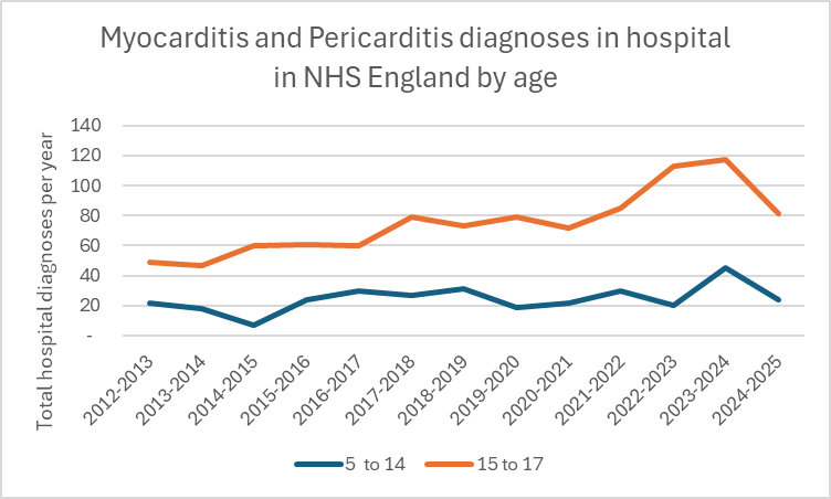
Figure 4: Myocarditis and Pericarditis hospital episode statistics by age and financial year
It is clear from national data that myo- and peri-carditis cases did not increase in 2020-2021, only rising steeply after April 2021 ie as the younger cohorts were being vaccinated.
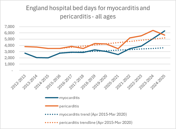
Figure 5: Total bed days for all ages for myocarditis and pericarditis in England by financial year
What they did not do
- They did not include Moderna doses nor the people in their 20s who were at highest risk.
- There was no breakdown of post-infection risk by vaccination status.
- No inclusion of data beyond 2022, even though NHS figures show myocarditis continuing to rise.
- No separation by dose number, despite known dose-response effects.
- No raw rates; instead of the standard “unadjusted vs adjusted,” the paper offered only “minimally” and “maximally” adjusted models.
- No control condition to verify that the adjustments behaved reasonably.
Each omission leans in the same direction: infection appears more dangerous, vaccination appears more benign.
There were a string of biases
A Biased sampling of “sick” children
- They minimised conditions after vaccination by excluding the majority of sick vaccinated children who were injected before 6 August 2021 while including sick children in the unvaccinated comparison.
- They inflated conditions among those with a diagnosis by including all “cases” from spring 2020 when only children testing positive were those with access to tests because they were already patients. That is why conditions were present on day zero after diagnosis.
- They combined control groups and compared rates after diagnosis to the same people before diagnosis as well as to the undiagnosed but failed to show the analysis for each control group
- Similarly the vaccinated were compared both to the vaccinated prior to vaccination and to the unvaccinated but the analysis combined the two.
B Age groups
- Used 0-18 for diagnoses but 5-18 for vaccination comparison.
- An example of where this is unreasonable is for comparison of Kawasaki disease which is a disease primarily of preschool aged children (80% are under 5 years old):
They compared “Unvaccinated” = includes all younger children with “Vaccinated” = aged 5-17 but disproportionately older
The crude counts (e.g. 255 vs 15 Kawasaki) simply mirror these demographic differences as.
C Time frame
- Infection follow-up: Jan 2020 to March 2022
- Vaccination follow-up: Aug 2021 to Dec 2022
These are not like-for-like. There is no good reason to do this, especially when no attempt was made to present unvaccinated infection risk.
To minimise the risk from vaccines they diluted the impact over a 6 month window and looked at risk after first dose rather than the highest risk in period immediately after dose 2 and 3.
The risk was not from infection alone. There was something else that was happening after infection.
In Table S3 the authors present the risk in different time periods after infection. The first thing to note is the high number of events at day zero. This suggests a disproportionate number of children had the adverse event before testing positive i.e. they tested positive when admitted for one of these conditions. After day zero, rates declined sharply but remained statistically above the baseline for several outcomes during the early post-exposure weeks (e.g., weeks 5-26). Data was presented for vaccinated and unvaccinated combined. It is impossible to determine from these data whether this represents a continuing decline from the day zero artefact or a true association with the exposure.
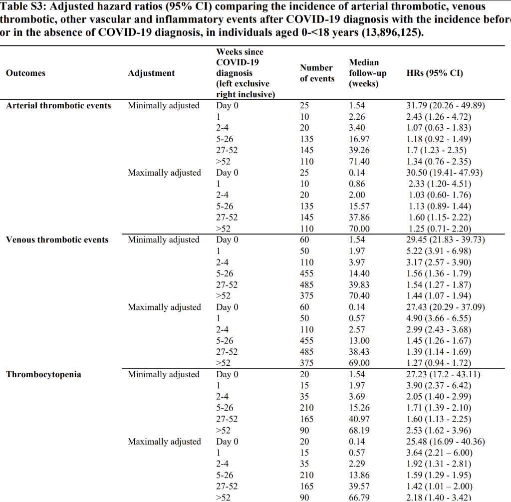
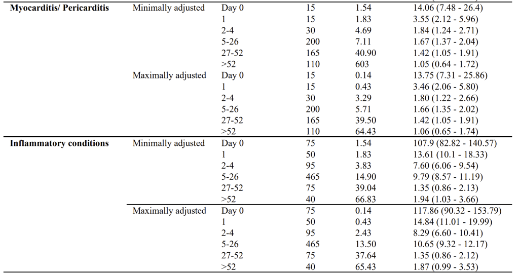
Figure 6: Table S3 from the supplementary appendix with events over time. Note the different sizes of the time periods accounts for most the difference in this raw data which needs to be converted to daily rates to be of any meaning.
How could the risk of an infection appear so late on?
The risk is clearly only early on from their own graphs. Here you can see the hazard ratio plotted against week since diagnosis comparing those who tested positive with both the same individuals pre diagnosis and the undiagnosed. The grey line includes the period where test positive children were disproportionately hospitalised for other conditions and has a very high day zero rate. The black line is for the later period from June 2021. The claim of a sustained risk long term from infection is not supported by this graph.
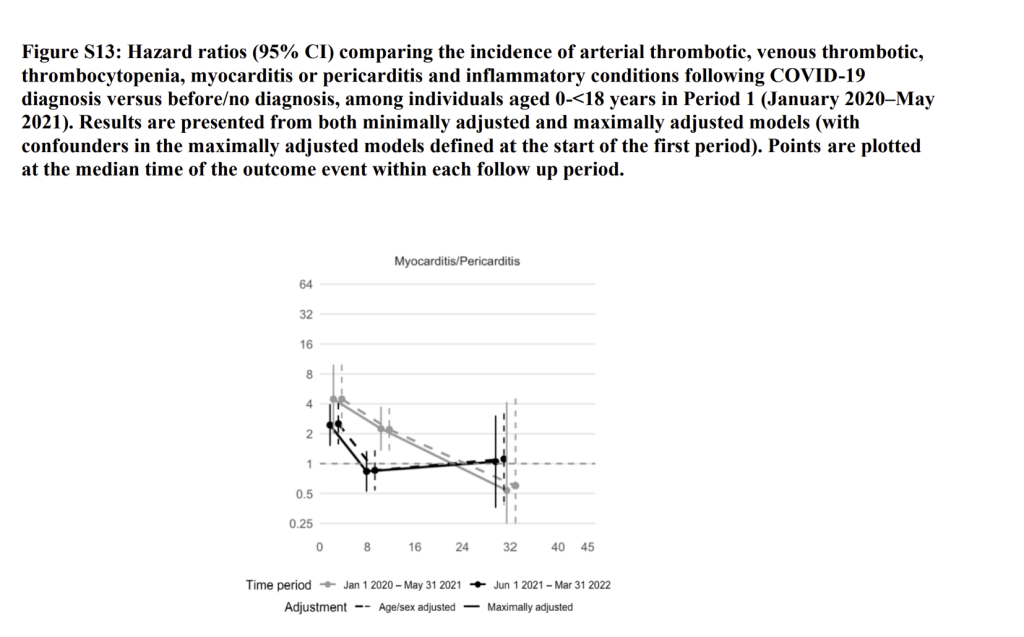
Figure 7: Graph from supplementary appendix showing how the day zero problem continued after May 2021
D Flaws in the Nature paper too
The Nature paper we are using as a control was not flawless. e.g. they claimed 86% of 12-17 year olds received a first dose which does not tally with UKHSA data (see below). Higher denominators reduce the rates claimed regarding risk.
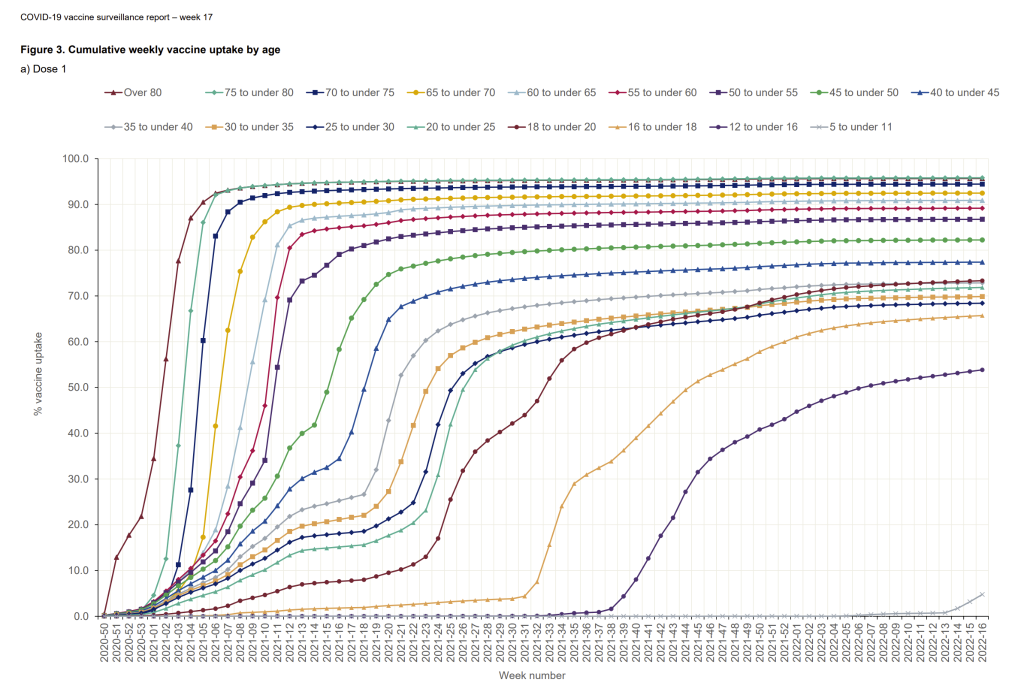
Figure 8: Graph of covid vaccine uptake by age from UKHSA by June 2022
This same Oxford group had previously published a paper looking specifically at myo and pericarditis, which has been widely misquoted as stating that risk is higher after infection than vaccination. But in their own abstract they showed that in “men younger than 40 years old, the number of excess myocarditis events per million people was higher after a second dose of mRNA-1273 than after a positive SARS-CoV-2 test (97 [95% CI, 91–99] versus 16 [95% CI, 12–18])”. When their authors were contacted for a breakdown by age bands in the younger cohort, they stated numbers were too small! A six-fold difference is not one to be ignored and it may have hidden a higher ratio in younger age groups. This was the Moderna rather than the Pfizer BioNTech product, but of course it is Moderna who is now in receipt of massive government funding for their new mRNA research and production facility near Oxford.
Conclusion
The latest analyses from Oxford and UKHSA/Imperial were presented as reassuring evidence that vaccination reduced myocarditis risk compared with COVID-19 itself. But the methodological choices uneven time frames, merged age groups, missing raw data, and selective comparisons all led in one direction: making vaccines appear safer than they were. The overlooked patterns in the data, including several years of higher risk after vaccination reveal a more troubling reality. Science should be transparent, even when the findings are uncomfortable. The real story is not about a virus versus a vaccine, it is about the importance of honest analysis and the consequences when data are adjusted to fit a preferred narrative. Until we confront that, we will keep repeating the same mistakes and the same misleading headlines.