

Not Good News, but is there a Smoking Gun?
Recent mortality data published by the Office for Health Improvements and Disparities makes uncomfortable reading.
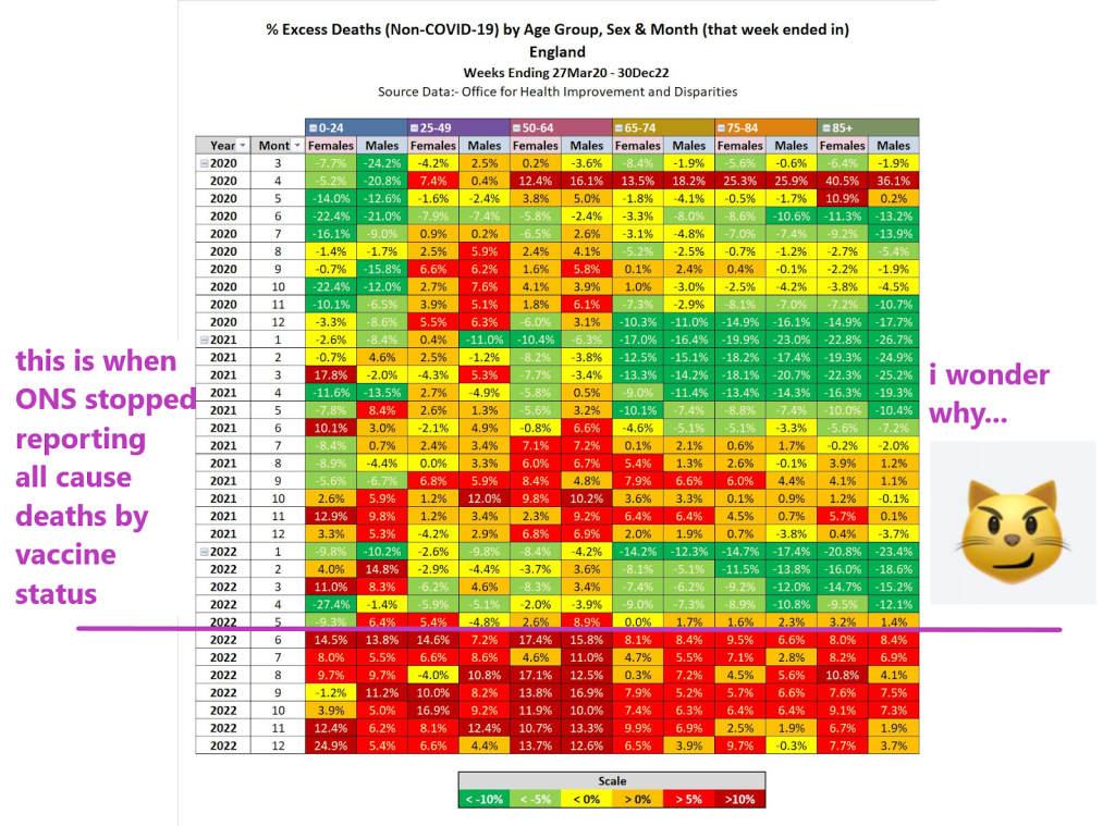
N.B. the table shows total deaths with covid deaths subtracted
It looks like ‘something(s)’ happened in April 2020, the middle of 2021 and in the second half of 2022. This is not exactly what you would expect to see if 2020 was a catastrophic plague year, followed by the roll-out of a ‘safe and effective’ antidote. What could these ‘somethings’ be? Can we infer anything from this high level data?
Concerns about excess mortality have been a consistent refrain – on all sides of the debate – from early 2020, driven (initially) by a fear of and panic about an unknown respiratory disease that had swept various regions.
However, the ‘asymmetric shock’ introduced by the imposition of draconian non-pharmaceutical interventions (NPIs) in March 2020 – and their consequences, such as the disruption to healthcare for the infirm, aged and vulnerable – makes straightforward analysis of mortality statistics extremely difficult. There is no counter-factual for comparison purposes, and therefore it is very difficult to ascertain the difference between deaths ‘with Covid’, ‘of Covid’ and ‘by NPI’. Simply put, if Covid diagnoses could be handed out like confetti, is it not possible (or even likely?) that Covid was overdiagnosed? In which case, the prescribed cures (NPIs) – as we know a bitter pill to swallow – were even more certainly worse than the disease. The collateral damage was material (as well as unnecessary).
This leads on to a second concerning thought – if that was the case, how would authorities seek to find an ‘off-ramp’ from such a terrible blunder? In business terms, could a White Knight be found to grab success from the jaws of victory, perhaps providing a suitably dignified exit – let’s call it a Saviour Narrative – for the hapless leaders who had piloted the ship onto the rocks in the first place? That leadership might in fact be tempted to state that “There Is No Alternative”: save yourselves (and others) by submitting yourselves to the White Knight!
Such a White Knight Saviour must not in itself cause harm, as it is well known that two wrongs don’t make a right. Poker players will know that doubling down is a risky – and potentially costly – strategy.
So what would, then, happen if the White Knight did indeed turn out to be somewhat Darker than hoped? Almost everyone would be highly averse to an admission that the White Knight Saviour Narrative was flawed. No-one – apart from perhaps a handful of sceptics – would be willing to point out that the Emperor was, in fact, unclothed.
Those who have been paying close attention will note the relevance to these two following observations: (1) turkeys do not vote for Christmas, and (2) cigarettes are highly profitable to cigarette manufacturers (and it is worth highlighting that many doctors were happy to endorse their favourite brands).
But let us park these two points for the minute – let us go back to the mortality statistics.
HART has previously expressed concern about ‘out-of-sync’ mortality statistics – we flagged a particular spike in young males in May 2021 and have written extensively about elevated mortality levels through much of 2022, something that was noted in the mainstream media back in the summer.
It has to be stressed that such population-level data is subject to all sorts of artefacts such that crude data ‘eye-balling’ is fraught with risks – splitting datasets up into separate age group sub-sections can result in what is known as a Simpson’s Paradox: a trend or result when data is put into groups reverses or disappears when the data is combined. It is therefore imperative to tread carefully when looking at such large datasets where the underlying confounding – or ‘lurking’ – variables are too numerous or complex to account for. It can take time to tease out critical warning signals from this underlying ‘noise’.
Of course, the luxury of time is something that one does not always have: thalidomide was created in 1953, licenced for over-the-counter use in Germany in 1956, then in the UK in 1958 before an Australian doctor raised the alarm in 1961 leading to it being withdrawn.It was a full – and scarcely believable – five years after being made available as an over-the-counter drug, despite the very visible – and obvious – effects of thalidomide on those affected.
The story is made all the more shocking when one notes the circumstances that led to the drug never being made available for use in the United States:
One country that did not approve thalidomide for marketing and distribution was the USA, where it was rejected by the Food and Drug Administration (FDA). Pharmacologist Frances Oldham Kelsey turned down several requests from the distributing company who did not provide clinical evidence to refute reports of patients who developed nerve damage in their limbs after long-term thalidomide use. This prevented the drug thalidomide from ever being used in the United States.
Oldham Kelsey, the pharmacologist that turned down the application, was in her first month at the FDA when she first turned down the application. The detail of the extent to which the FDA was pressurised makes for fascinating reading: after all, this decision was keeping a seemingly successful drug out of the lucrative US market.
The rest, as they say, is history. There are many lessons, not least that early signals are best heeded – as Oldham Kelsey wrote in 1961: “The burden of proof that the drug is safe … lies with the applicant”. Quite.
So back to the data. What could possibly be the cause of all this recent death? There is no shortage of suggestions: people doing more/less exercise, NPIs were too loose/stringent, high/low injection uptake, “stroke season”.
As absurd as such a disparity of suggestions may be, they contain a useful lesson. Tempting as it might be to seek out simplistic single-parameter cause/effect models to explain the increase in mortality, it is worth remembering that ‘all models are wrong, but some are useful’, or as per George Box: “Remember that all models are wrong; the practical question is how wrong do they have to be to not be useful”.
This is articulated clearly and in much more detail by Professors Neil and Fenton. Unlike disfigurement of newborns due to thalidomide (a more straightforward single cause / effect system), overall mortality is a multi-variable system:
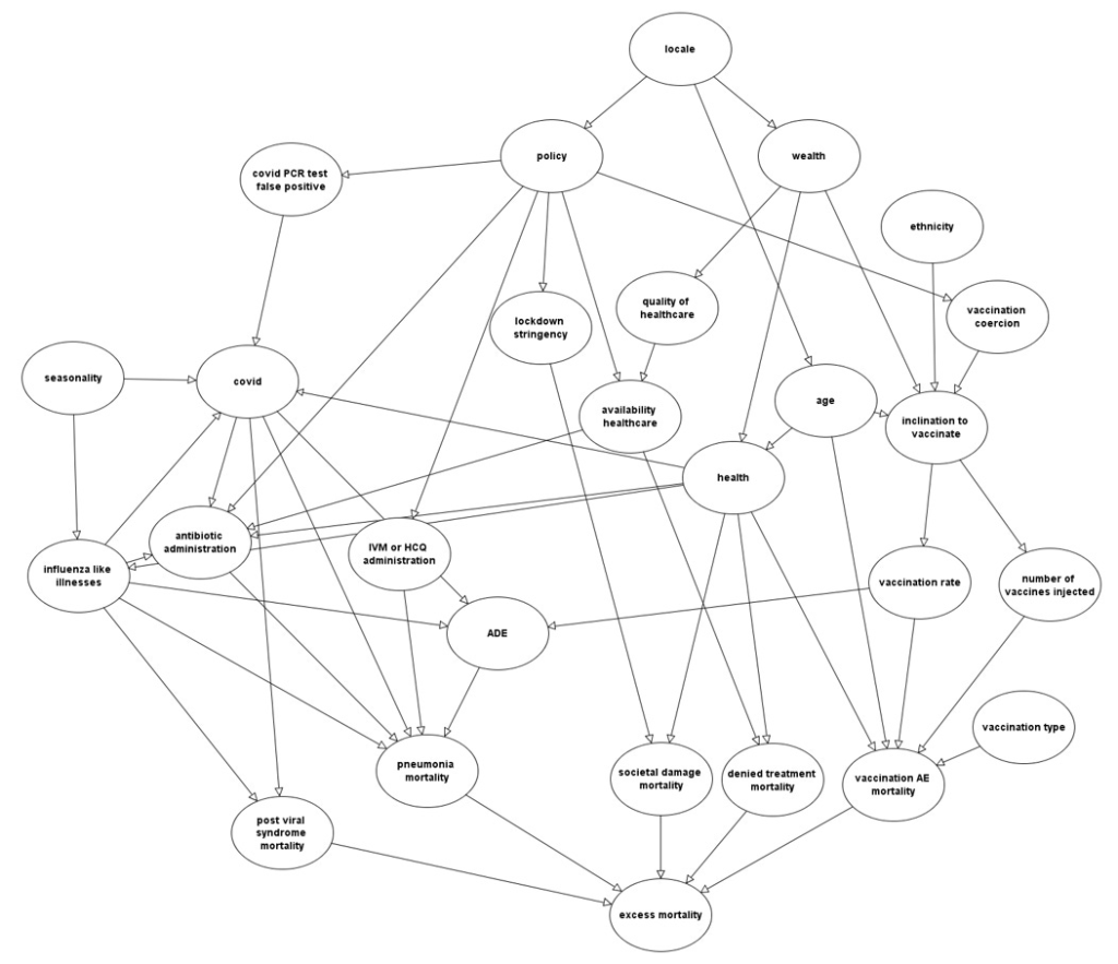
Compute that! And then take into account what a ‘normal’ background level of excess mortality might be, taking into account seasonal and other factors such as anomalous winter cold, summer heat, etc.
With this degree of complication and confounding, it would require an incredibly strong signal to punch through the noise – for example, a ‘red flag’ signal might be clearly visible if there was an IFR “injection fatality rate” of 10% within, say, three months of administration of the pharmaceutical. One might say that this is a statement of the blindingly obvious, but we should be grateful that there is no obvious smoking gun in the overall mortality statistics, or things would likely be far worse than they are now.
But what if the injection fatality rate was 0.1% within six months, or spread over a longer period of time? It could take years for such a signal to emerge from the noise to the extent that one could unequivocally pin the excess on a particular cause.
Where does this leave us? Rather than seeking outright proof in overall mortality statistics, which are highly confounded and interdependent, we should be seeking signals to help create hypotheses that can be investigated in more detail. For this, more data is required, and those public authorities (paid for by the taxpayer) have a moral duty to release the information that they hold as quickly as they can in the rawest form possible, not engage in pathetic foot-shuffling.
In the meantime, the precautionary principle applies. If intervention B is being prescribed to avoid outcome A, but there is risk associated with intervention B, then those who are at zero or negligible risk of outcome A should not be going anywhere near intervention B.
Iain Martin summarises matters succinctly:
The entire population was vaccinated or offered the vaccine, which now looks like a terrible idea when there were deaths among young people who really had no need to be vaccinated. They were not at risk from Covid. The mantra was it limited transmission. We hear less about that now. Parliament was shut down. Government colluded with social media giants to suppress legitimate questions about the origin of the virus and all manner of other policy debates.
HART calls on the Office for National Statistics to get off its metaphorical hands, stop tweeting nonsensical and misleading data ‘takes’ that result in admonishment from the Statistics Regulator and to publish the raw data that it is sitting on. The public has a right to access the data that their taxes are paying for.