

How New York City’s covid graphs misled the world
Dr Clare Craig
11 March 2026
In January 2022, New York City published graphs that appeared to shatter claims the vaccines were not the saviour that had been promised and settle the covid vaccine debate for good. Almost all cases, hospitalisations, and deaths were shown to occur in the unvaccinated. Emergency physician Craig Spencer shared the charts: “The graphs speak for themselves. Absolutely stunning.”
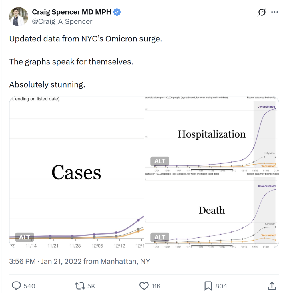
Tweet from Dr Craig A. Spencer, MD, MPH on 21 January 2022
This is what the graphs looked like in full.
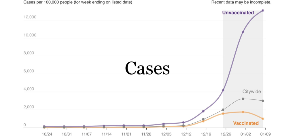
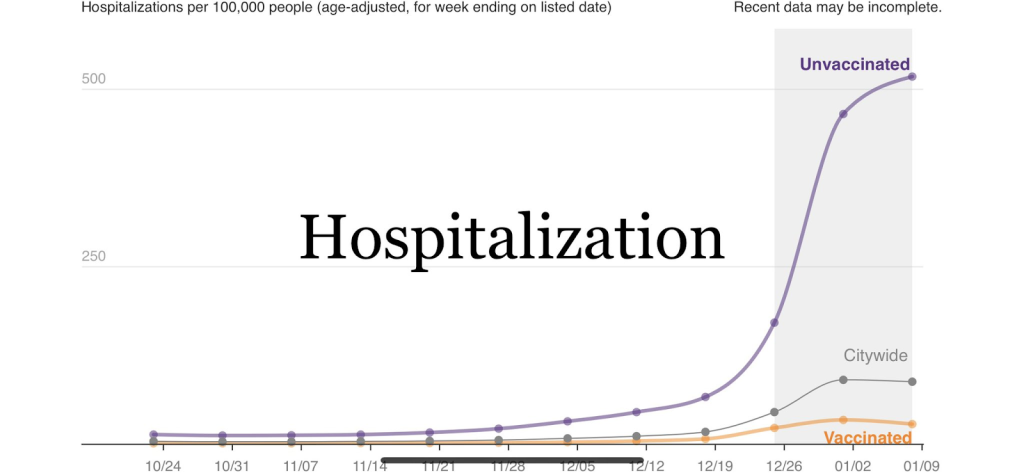
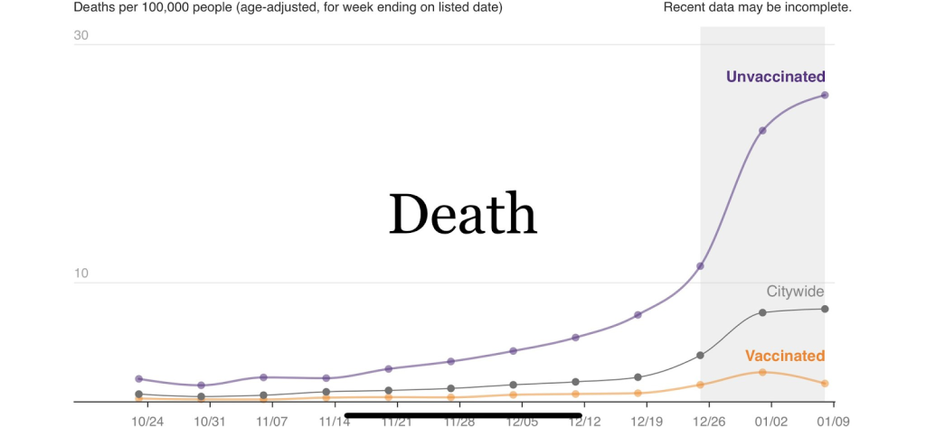
They were stunning. But not for the reason he believed.
The claimed peak of 500 per 100,000 (aka 0.5%) per week, is 3.8 times higher than the huge peak in spring 2020 of when the entire city was unvaccinated (1,566 weekly peak which is 130 per 100,000). Why should the unvaccinated have been at nearly four times greater risk just because others were vaccinated?
The hospitalisation claim
Extrapolating the hospital curve for the whole wave works out at a claim that 1 in 50 unvaccinated people would end up hospitalised. If we assume 15% of New Yorkers were unvaccinated that would be enough to fill every hospital bed in the city (~25,000).
Many reported “covid hospitalisations” included patients admitted for another reason who happened to test positive while in hospital. Since those at greatest risk of hospital admission for any cause were also the most heavily vaccinated in New York, this alone complicates simple comparisons by vaccination status.
The case, hospitalisation and death rates were all calculated based on a numerator figure divided by a population denominator. Both numbers were wrong.
Headline figures
NYC’s dashboard presented cumulative data from 17 January 2021. By counting every infection from early 2021 – when almost nobody was yet fully vaccinated – the calculation guaranteed that most infections would fall into the “not fully vaccinated” category.
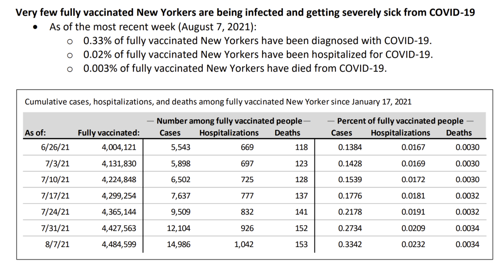
Figure 1: Extract from New York Health claiming minimal hospitalisations and deaths among New Yorkers despite the fact that those at risk of covid death were heavily vaccinated
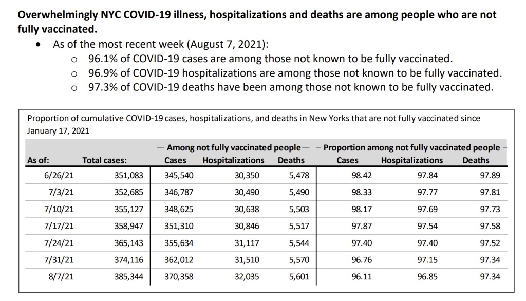
Figure 2: Extract from New York Health report claiming unvaccinated were driving covid at the time
Note the careful wording above. The dashboard did not say “unvaccinated.” It said “not known to be fully vaccinated.”
These figures were cumulative from January 2021 — when almost nobody was yet fully vaccinated. By counting every infection from a period when the vast majority had not received two doses, the calculation guaranteed a huge “unvaccinated” excess.
The numerator: who counted as “unvaccinated”?
In New York logic you could be discharged from hospital for another reason 14 days before testing positive and that would count as a hospitalisation. “COVID-19 hospitalizations: hospitalization within 14 days before or after COVID-19 diagnosis date or at time of COVID-19 death.” For deaths it was any cause within two months: “COVID-19 deaths: death within 60 days of COVID-19 diagnosis date or where COVID-19 cause of death is listed on the death certificate.”
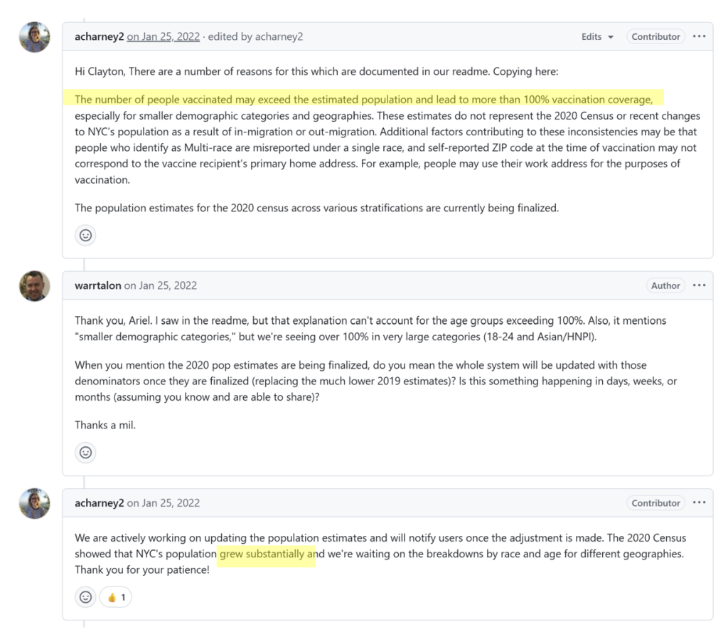
But there was a bigger problem. A contributor to NYC’s own public GitHub data repository confirmed in writing:
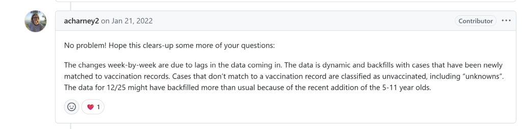
There was a problem with records that did not match:
“Vaccination status was defined as fully vaccinated if the patient had completed a full vaccination series (two or more doses for Pfizer or Moderna or one dose for Janssen/Johnson & Johnson) at least fourteen days before RT-PCR specimen collection; otherwise, the patient was considered unvaccinated at time of specimen collection. If the subject lived in New York and no vaccine data were available in CIR [Citywide Immunisation Registry] or NYSIIS [New York State Immunization Information System], they were classified as unvaccinated. Vaccine status was classified as unknown if they lived outside NYS and no vaccine data was available on CIR or NYSIIS.”
There were therefore three ways you could be vaccinated but called unvaccinated or unknown:
- You had only one dose or were within two weeks of your second dose when you tested positive
- Your data was not in the system or was in the system but could not be matched when they searched for it
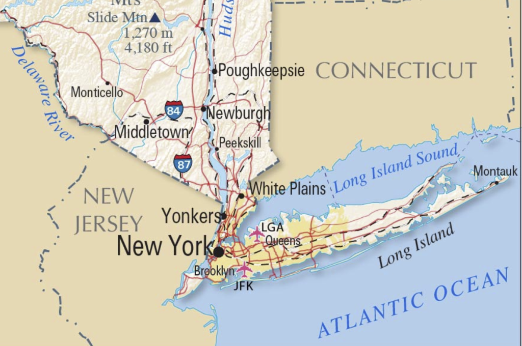
- You lived outside New York State – which may mean living as close as New Jersey or Connecticut
In a city with a fragmented healthcare system, anyone whose vaccination record could not be matched — misspelled name, missing date of birth, record in a different system — was counted as unvaccinated. The category was a dumping ground for unmatched records, corrected only retrospectively.
This was not unique to New York. An audit of data in Kansas and Missouri found that 44 percent of those classified as “unknown” vaccination status were in fact vaccinated.
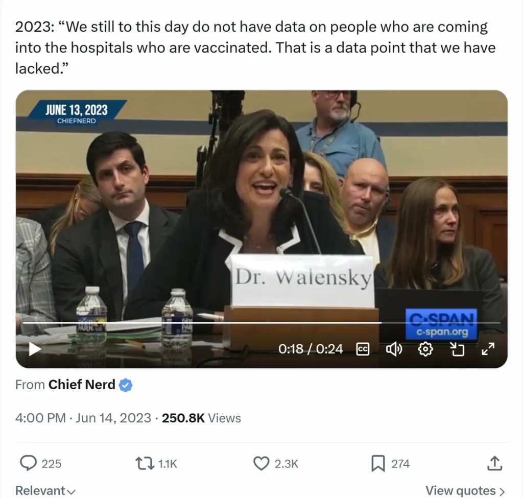
In June 2023, outgoing CDC Director Rochelle Walensky admitted during congressional testimony:
“We still to this day do not have data on people who are coming into the hospitals who are vaccinated. That is a data point that we have lacked.”
The denominator: the wrong population
NYC’s technical notes confirm that rates per 100,000 were calculated using “annual population estimates for all New Yorkers as of July 1, 2019” — figures that did not reflect the 2020 Census.
Their official GitHub records show that they were using the much lower 2019 data for the population measure, not their own 2020 census which showed the population “grew substantially”. Anyone who avoided taking part in the census was also not included.
Using 2019 estimates, the unvaccinated population was approximately 1.36 million. Using 2020 Census figures, it was 1.82 million — nearly half a million more. A larger denominator produces a lower rate. The effect was to inflate unvaccinated rates by roughly a third.
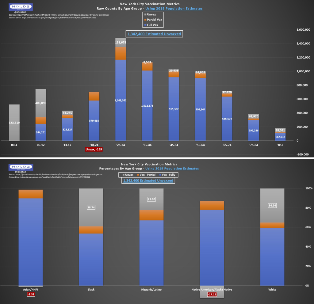
Using the 2019 denominator meant that for particular groups the number who remained unvaccinated (estimated by subtracting the vaccinated count from the population estimate) was negative! Negative people cannot exist. The denominator was wrong.
The negative values from January 2022 are highlighted in red here:
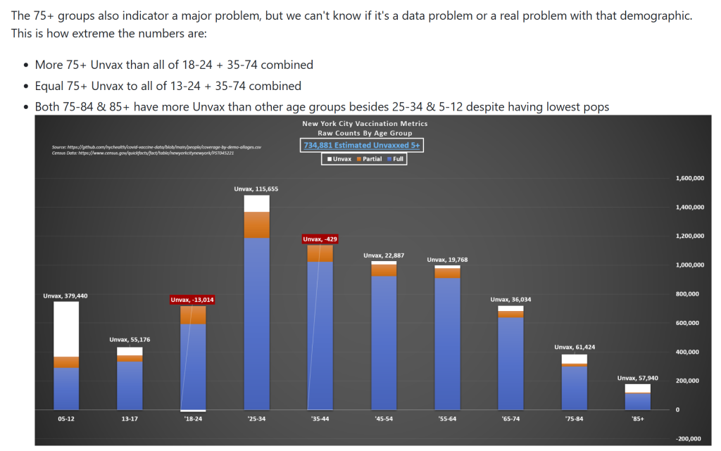
By February 2022, the numbers looked even worse:
New York City knew they were underestimating the denominator and skewing the results. However, they had decided to wait until March 2022 to make all the corrections at one time.
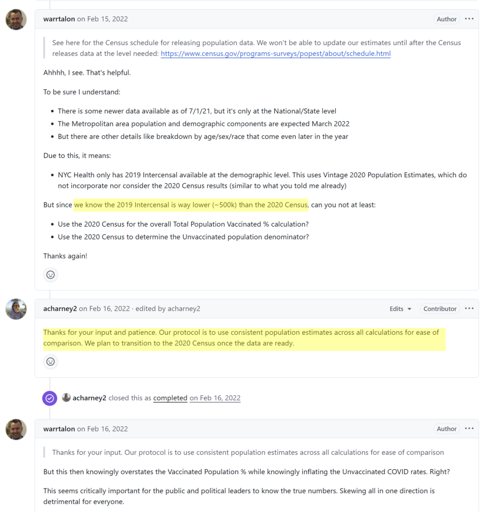
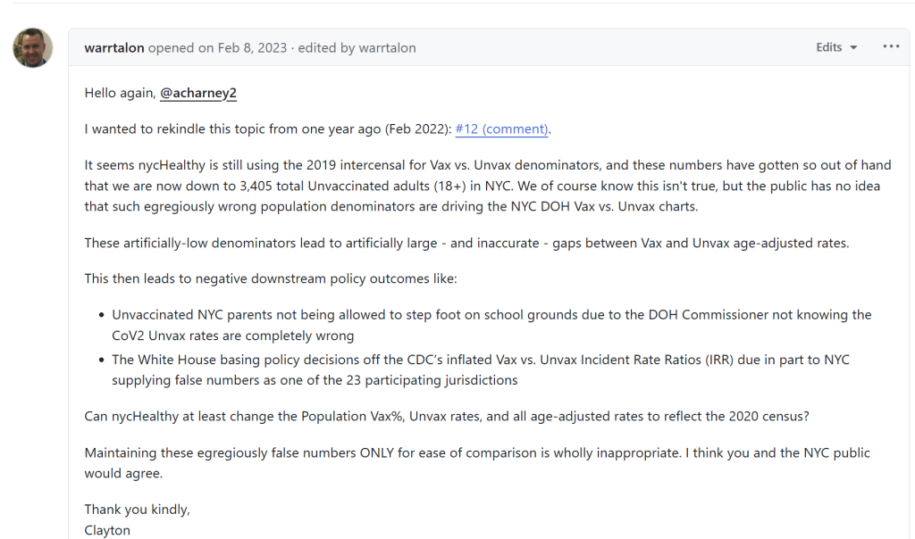
By February 2023, the denominator had still not been changed.
And this was the final response on the Github “We are aware of the issues presented with using the old census numbers but we are still waiting for final 2020 Census data.”
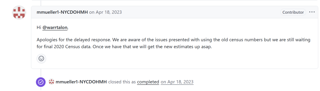
For fifteen months, New York City published rates it knew were based on a denominator it had acknowledged was wrong.
When rates were recalculated using 2020 Census data, the case rate ratio fell to approximately 2:1 and the hospitalisation ratio to 3.3:1 — far from the 10-fold differences being claimed. Once the numerator issues were factored in they would have fallen further still.
What this means
The NYC data were not evidence that vaccination was dramatically reducing hospitalisations and deaths. They were the product of an inflated numerator — built from unmatched records, cumulated from a period of minimal vaccination — divided by a deflated denominator based on outdated population estimates. The result was graphs that appeared to show a dramatic effect where the underlying data did not support one. These graphs were used to justify vaccine mandates that excluded people from workplaces, restaurants, and public life.