
ONS model away the excess mortality
Mathematical modelling has a role to play in predicting deaths, but as with all modelling it needs to be used very carefully. We have seen modellers who make the assumption that everyone was susceptible to covid then producing dramatic graphs that show everyone would catch it. We’ve also seen modellers who assumed masks worked, then producing dramatic graphs of how they could minimise covid. Of all modelling crimes, putting your conclusion into your assumptions is surely the worst.
That is what ONS have done with their latest modelling to estimate expected deaths. It is more than reasonable to account for things like age, sex, region, seasonality etc when estimating expected deaths. They were not doing this with their previous 5 year average baseline – which did at least have the advantage of simplicity.
Double Counting
The ONS has a legitimate role to play in exposing changes in mortality that cannot be accounted for through demographic shifts. However, their new methodology hides such changes. Instead of removing every change in mortality for which there is an identifiable cause, they also make other adjustments. The trend in deaths, i.e. if they are rising or falling, is due to one of two things:
- The change in demographics
- Health changes
This means they are double-counting the changes to age and sex because they also include the trend changes. Worse, any changes due to a problem with health gets baked into their next prediction of deaths. If deaths have been high then they say we should expect them to be high. They have created a model that would call a hockey stick rise in deaths something which should be almost entirely “expected”.
If their role was solely to accurately predict mortality this trend-based methodology might be acceptable. But surely that’s not why we look at mortality data. The point of looking at mortality data is to see if something is causing more deaths than what we would expect. Using their new methodology, however, the expectation of too many deaths ends up being wrapped into the numbers of deaths predicted, subverting the main function of ONS mortality reporting.
Modelling
Until February 2024, ONS used variations on a theme of taking the average of the previous 5 years as a baseline. It was easy to understand but had problems. A continuously ageing and growing population meant that instead of deaths being sometimes above and sometimes below expectations they were pretty much always above expectations. Their new model is so contrived that it results not only in a huge jump in expectations for 2023 but also for 2019. You see, they could not risk having a higher baseline for the “pandemic” or else what was the “world-beating pandemic response” all for?
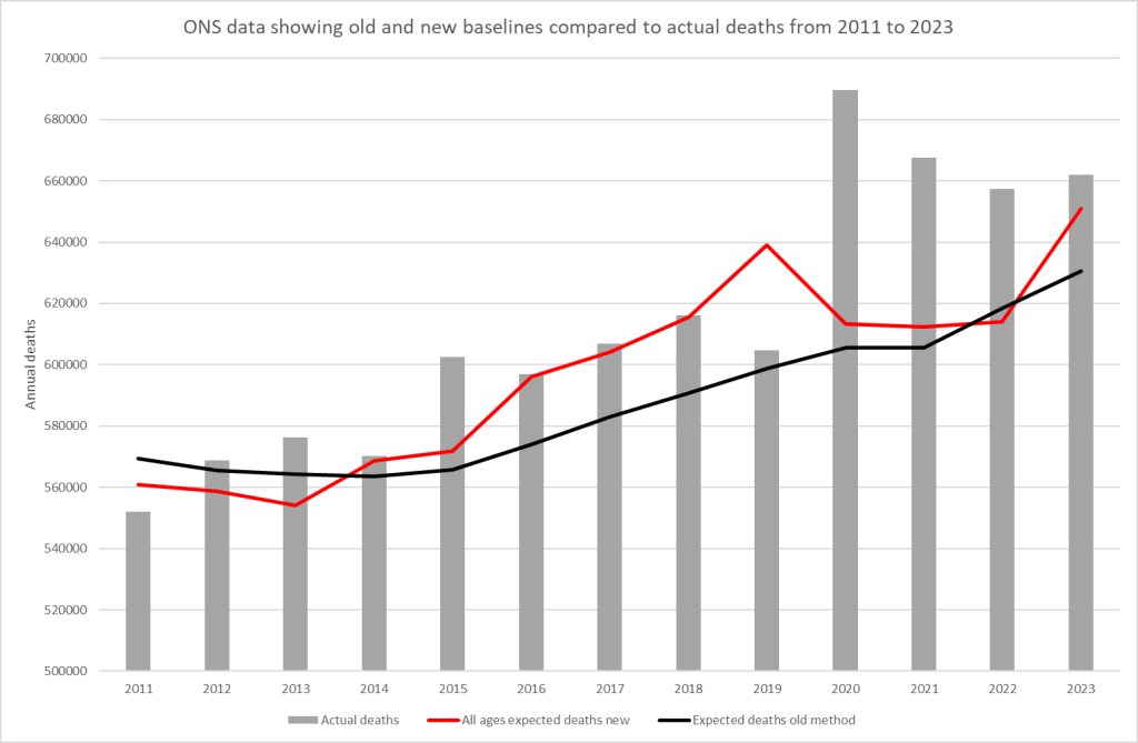
The consequence of the crazy estimate their new model spits out is that a total of 110,000 more deaths were “expected” from 2016-2019 compared to their old model. It also means that 2019 went from having an excess of 3k deaths to a deficit of 36k. If 36,000 people who were “expected” to die in 2019 did not have their deaths registered, then surely that paints the excess in registrations in 2020 in a different light.
What they did achieve was to keep the baseline low in 2020 and 2021 to keep the “pandemic” myth afloat. They did this by totally ignoring months with high mortality. The consequence was that the low numbers of registered deaths in early 2020 and before and after each wave are used to suggest a “low trend” which keeps the baseline low. This strongly suggests they are feeding the trend changes in over a short time frame. They never state the time frame they use.
The ONS methodology is complex and opaque – for example, they have failed to publish any of the weightings they have used in their formula. However, Office of Health Improvements and Disparities (OHID) has produced a simpler model that we can use for comparison.
The Office of Health Improvements and Disparities
A younger and less well known agency of government, OHID produced a model based on the 2015-2019 average, but including projections to account for changes in age and size of the population.
Their conclusions are very different from those of the ONS. In fact the “expected” deaths for the two can be compared to an extent. The ONS have failed to share the age breakdown for expected deaths for England, while of the four UK nations OHID only cover England, so we have to make an adjustment for the comparison. In the graphs below, the OHID figures have been scaled by a constant percentage to match the UK data from ONS for 2020 and 2021.
Let’s start with 50-64 year olds as they have the worst excess mortality in 2022 and 2023 in percentage terms.
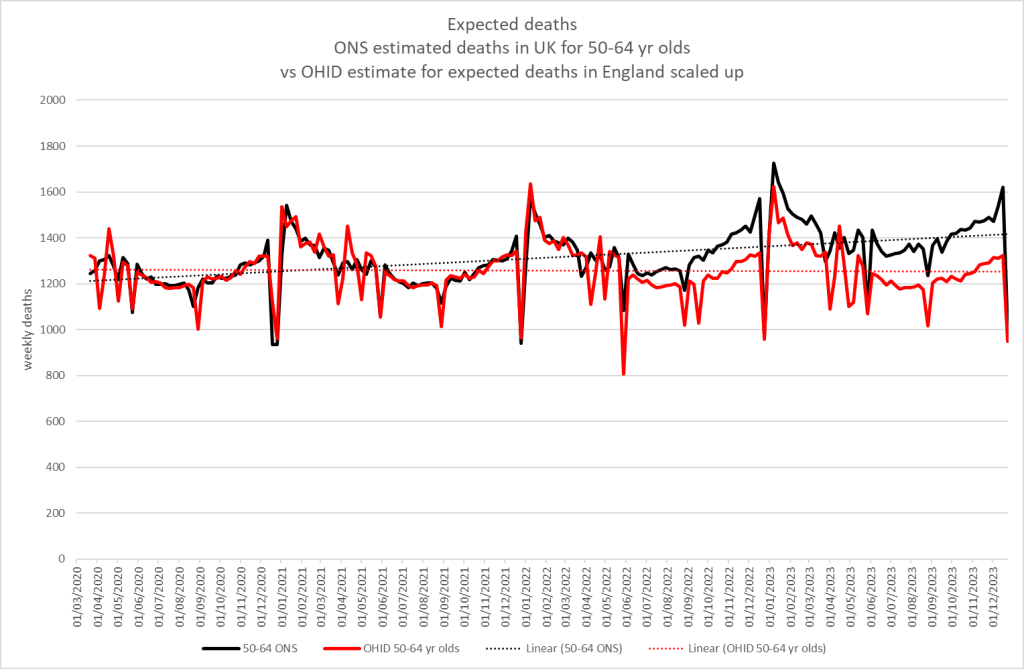
This shows a massive discrepancy from mid-2022 onwards. For 2023 alone there are ~ 7.5K more deaths expected in 2023 by the ONS new method compared to OHID. That’s 12% more than the OHID expectation! For every 8 people that OHID expects to die, ONS will ignore another death and call it “expected”.
As the ONS also provides population data, we can show that this has nothing to do with population growth. Here is the mortality data expressed as a rate per 100,000 people:
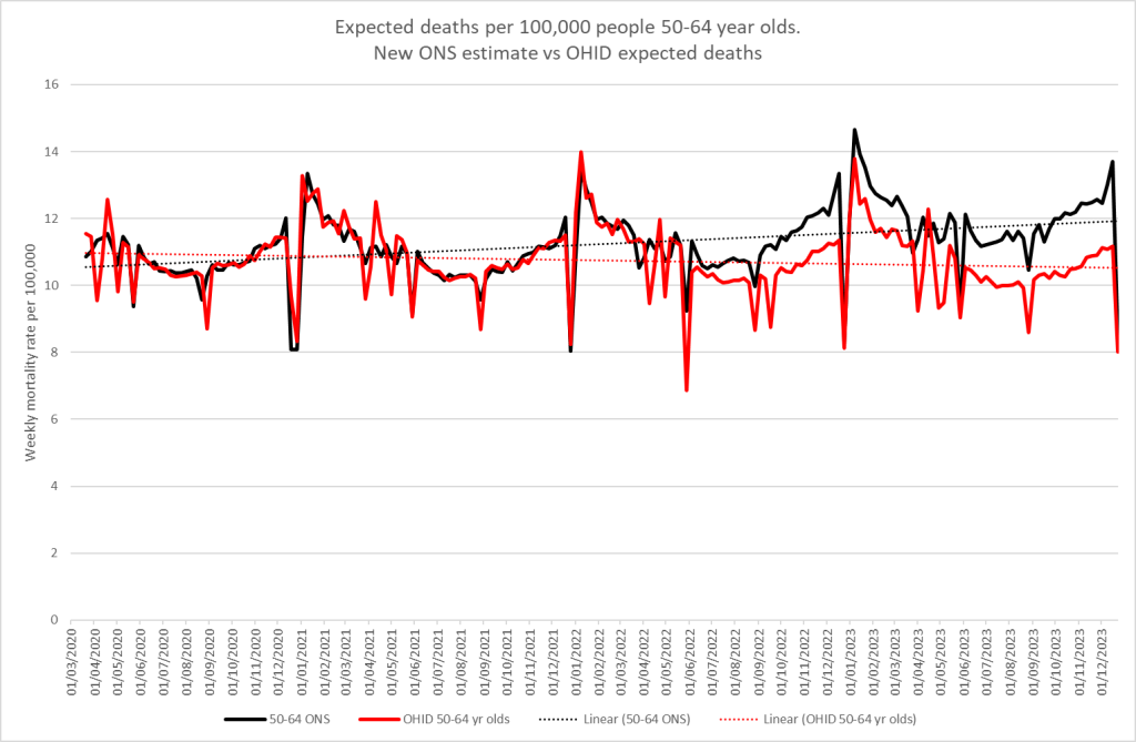
Why do the ONS expect increasing deaths in this age group? What on earth justifies that assumption?
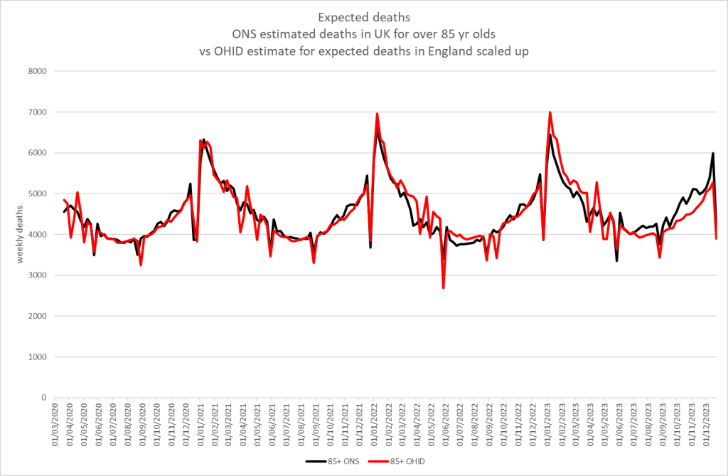
Oddly, the discrepancy is considerably less in the older age groups, which, as always, account for the bulk of deaths. For 85+ yr olds the discrepancy does not appear until mid-2023 and amounts to ~3k deaths for 2023. That’s only a 1.4% difference between the estimates.
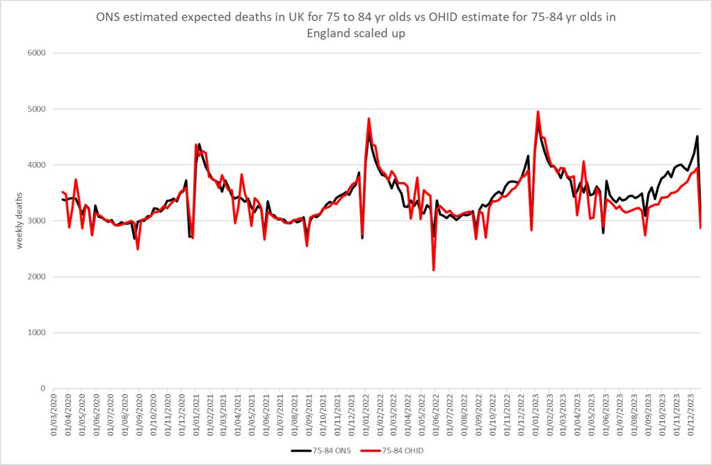
What about for the baby boomers? 75-84 yr olds also see a discrepancy, amounting to ~8k deaths in 2023 or 4.5% more deaths than OHID expected.
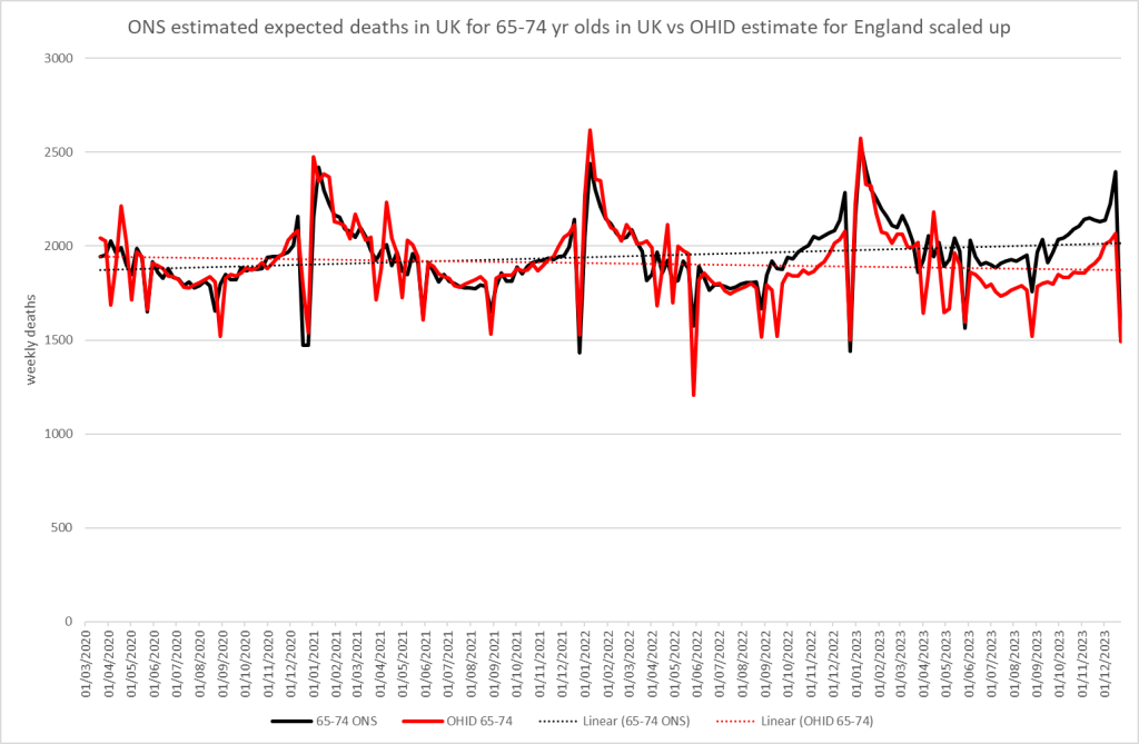
65-74 yr olds see a discrepancy from mid-2022. For 2023 alone it means ONS expected ~6,800 more deaths in this age group or 7% more. If you include the period from July 2022 there is a discrepancy of 9,000 deaths.
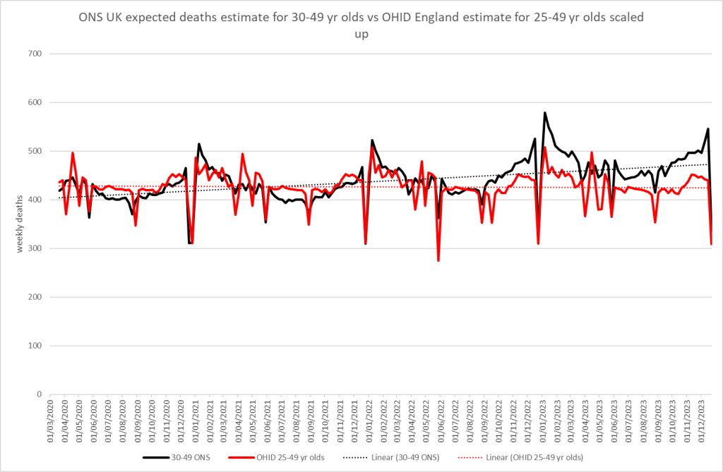
For younger age groups the age categories don’t align for example the ONS gives data for 30-49 year olds whereas the OHID includes 25-49 year olds. However, as we are only looking at trends, having aligned 2020 and 2021 for England and UK, this should not be material in the comparison. Why do OHID expect deaths to be constant and yet ONS thinks they should be increasing? In 2023 ONS expected 11% more deaths than OHID!
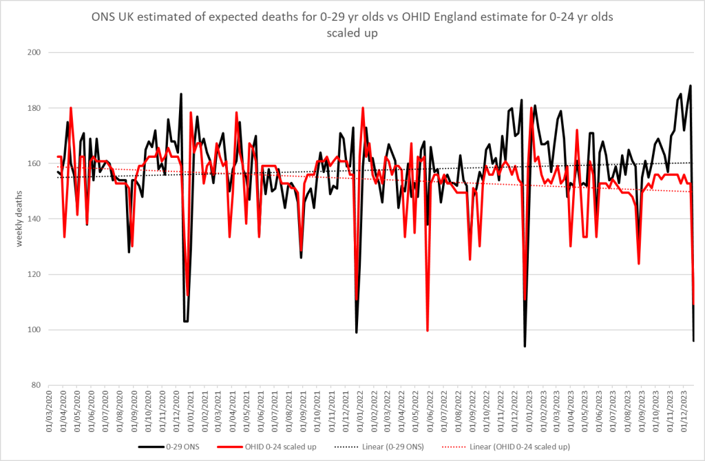
The youngest age group also sees a massive discrepancy. The ONS expects 7% more deaths than OHID. Again ONS expects increasing deaths in the young but gives no justification for why this should be.
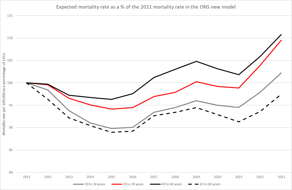
To be clear, this rise in expected deaths is NOT because of a rise in the population size, nor is it due to a longer term increasing mortality trend. Here is the expected mortality rate according to the new ONS model for our particular age groups. Why should mortality be expected to take a sudden jump like that in these young age groups in 2022 and 2023? This clearly appears to be a blatant attempt at hiding excess mortality, not an attempt at putting a figure on what would have happened to deaths in the absence of recent events.
We will not be able to make this comparison anymore going forward. On the same day that the ONS announced their new model, the OHID announced that they will be changing to an identical model. Why now? Why are both going to use identical methodologies? It stinks.
What also stinks is the fact that the ONS Deputy Director for Health and Life Events, who put out a video introducing the changes, was employed by both the ONS and the Cabinet Office, where she prepared the highly political presentation of statistics for slides in the briefing meetings that led to lockdown. She continued in this role until 2021 when she received a promotion at the ONS.

However, you can’t hide the truth forever. All that is needed is the calculation of an age-standardised mortality rate. This is a way of mapping mortality from a real population to one that has a standard age structure so different regions can be fairly compared with each other and across time. Using that methodology it is impossible to hide the issue of excess mortality. Furthermore, the excess deaths are predominantly cardiovascular, so the proportions of deaths by cause will inevitably be distorted in these new fantasy calculations.
HART will continue to report using open, understandable and honest interpretation of the data.
Everyone should consider lobbying their MP to demand the ONS revert to the previous methodology and publish anonymised patient-level detail. Transparency and data fidelity is the route to answers for all those that have suffered in the last few years.